>> This is the website of Paul Soulellis.
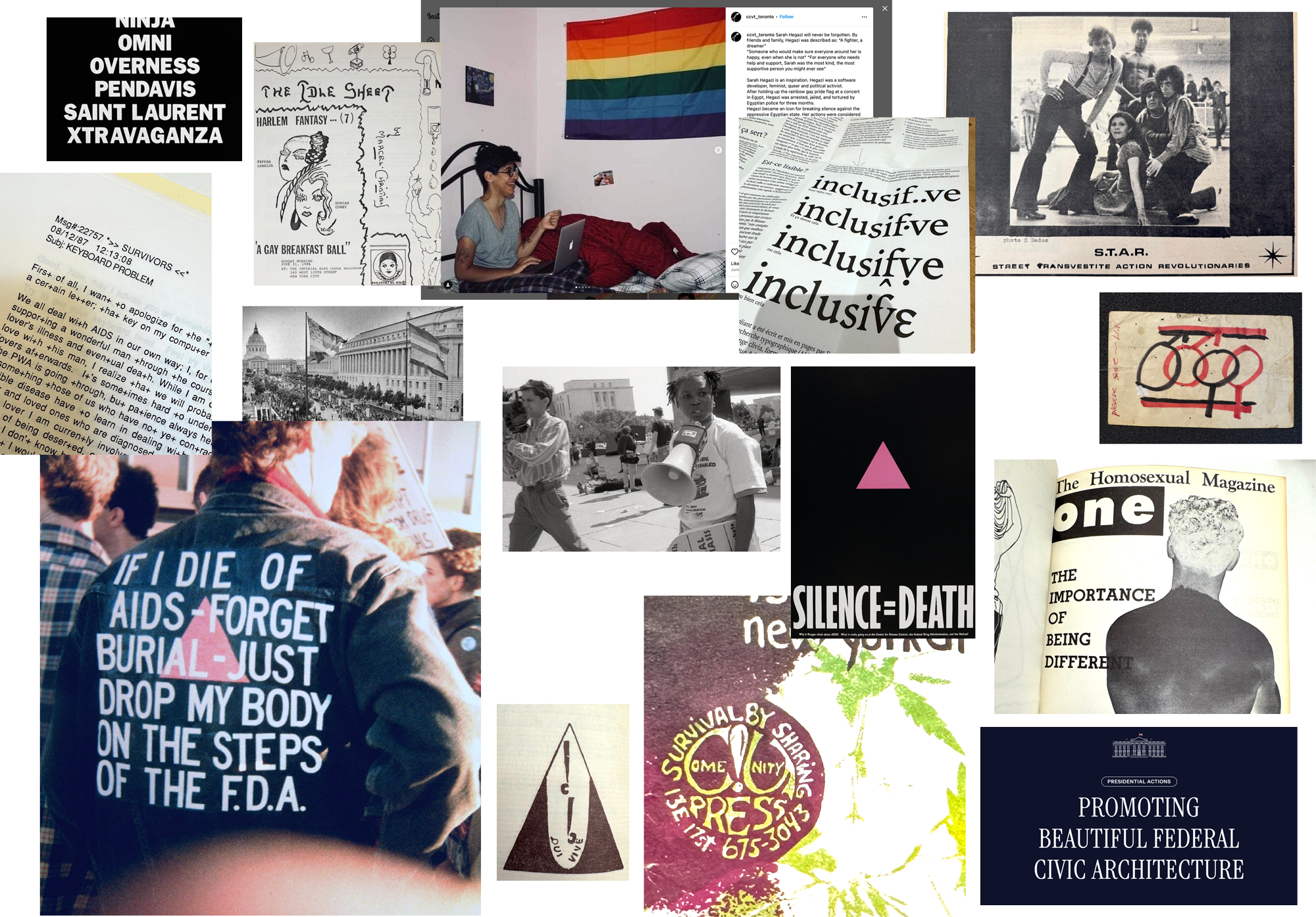
Paul Soulellis (he/him) is an artist and educator based in Providence, Rhode Island. His practice includes teaching, writing, and experimental publishing, with a focus on queer methodologies, network culture, and archival justice. He is the founder of Queer.Archive.Work, a non-profit project that supports artists with access to studio space, tools, and other resources for queer publishing. His writing has been published by The Journal of Cinema and Media Studies, Rhizome, MIT Press, Dispersed Holdings, Genderfail, and many others. He is an Associate Professor of Graphic Design at Rhode Island School of Design. His book Survival by Sharing: Essays on Queer Typography is forthcoming from Bikini Books in October 2026.
Work
Writing
Proximity artifacts (2025)
The typographic irregular (2025)
Cruising (2025)
The Permeable Closet (2025)
Quantum Queerness (2025)
Reading (2025)
Flagging (2025)
YouTube Typography (2025)
The future of typography is queer (2025)
Keyboard Problem (2024)
Monuments and ruins at Mashapaug Pond (2024)
Survival Printouts (2024)
An ethics of entanglement (2024)
Troubling time (2024)
Survival by sharing (2024)
Bad Archives (2023)
Dear Friend (2022)
Dear Sal (2022)
unfinished (2022)
What is queer typography? (2021)
Urgentcraft: Radical Publishing During Crisis (2021)
Urgent Publishing After the Artist’s Book (2021)
Reading Now (2020)
On the power of mutual aid publishing during crisis (2020)
Urgentcraft (2020)
Feed Time (2019)
The Post as Medium (2019)
At Home in the Archive (2019)
Queer.Archive.Work 2 at the Internet Archive (2019)
Publishing as practice as resistance (2018)
Performing the Feed (2017)
Notes on Feeds (2017)
Occupying Plöger’s Library (2017)
Urgent Archives (2017)
Rhizome (2015–2017)
Carrying, embeddedness, printedness. Window-into-the-page. A grand assembling. (2016)
Making Public (2015)
Performing Publishing (2014)
Search, compile, publish (2013)