Survival by Sharing: Essays on Queer Typography (2026)

Survival by Sharing: Essays on Queer Typography is a new book by Paul Soulellis, forthcoming from Bikini Books in October 2026.
This collection of essays examines design and typography as liberatory practices, emphasizing the networks, relationships, and strategies that sustain queer life. Building upon the widely-circulated 2021 essay “What is queer typography?,” the book foregrounds the material and social lives of texts—how printed matter, publications, and ephemera circulate, connect, and preserve knowledge across generations. By attending closely to these urgent artifacts and the queer acts that animate them, the essays explore the ways typography functions as a form of care, resistance, and cultural memory.
Drawing on the idea of cruising from José Esteban Muñoz, the collection is organized around a methodology that treats research and writing as embodied, relational acts, moving fluidly between archives, intimate encounters, and public histories. From the author’s own memory of early HIV/AIDS media, to defiant acts of flag waving, to a slippery series of encounters at the largest LGBTQIA+ archive in the world, Survival by Sharing highlights cruising as a non-linear form of wayward navigation between queer history and lived experience in the margins. Other tactics proposed in the book include variable legibilities, archival proximities, and time-warped entanglements. Moving away from capitalism’s dominant logics of success, the book emphasizes provisional and experimental forms of knowledge-making that reflect the improvisational strategies of queer life and community.
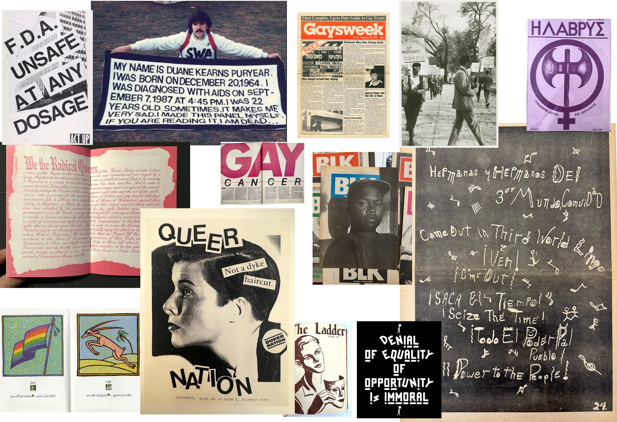
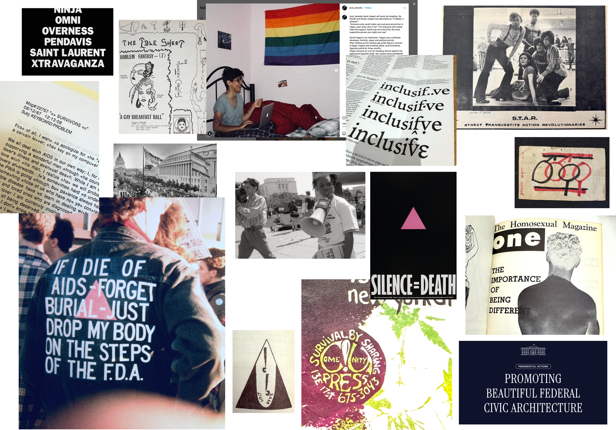
The essays engage a wide array of lesser-known materials and media, breaking new ground with never-before-published research around protest signs, computerized bulletin boards, newsletters, zines, typefaces, journals, flags, community spaces, and small press publications. In one chapter, Survival by Sharing situates the phenomenon of “new grammars” in inclusive, genderqueer writing with the work of type collective Bye Bye Binary; in another, Alan Bell’s oral history recounting life in Black publishing is woven into the reparative histories of Nat Pyper’s queer archival fonts. Survival by Sharing challenges conventional hierarchies in design and literary history, offering alternative modes of pedagogy, historiography, and collective practice; ultimately, the book positions queer design within far-reaching networks of survival and care, revealing the ways design and language are mobilized to sustain life and envision futures.
Preliminary specifications
- Type: softcover book
- Dimensions: 13 cm x 20 cm
- Pages: 304
- Word count: 60,000
- Language: English
- Images: 150+
- Printing: Offset lithography
- Binding: sewn and glued
- Publisher: Bikini Books
- Release date: October 2026
- Edition: 3,500
Survival by Sharing: Essays on Queer Typography by Paul Soulellis is forthcoming from Bikini Books in October 2026.
Early drafts of some of the essays can be read here.
