Publishing as practice as resistance
A talk presented at the Boston Art Book Fair
October 13, 2018
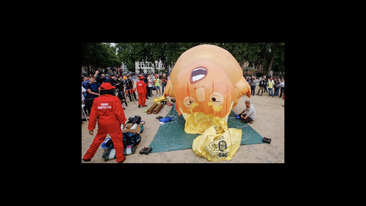
I’m increasingly disappointed by so-called protest art, and a rhetoric that relies on humor, humiliation, and spectacle. Not that we don’t need laughing and crying. But parody and satire feel insufficient right now, even negligent. I don’t want to contribute to the entertainment factor, the instinct to fuel the addictive, sickening cycle of news surrounding the current administration.
Instead, I’m looking more and more towards critical writing, not visual art, for clues about how to deal with crisis, particularly around failure and futurity. How do we look forward, when our vision is blurred in a vertigo-like spell of confusion. How do we find new ways to construct culture, to imagine new societies, when the tools that we might use are restricted and bound up in systems of oppression. Caught up in ideologies that are historically defined by racism, misogyny, fear, and the production of capital in and around these forces. So I’ve been looking for help from writers and theorists.
The struggle is soothed somewhat by teaching, where I get a chance to engage in direct conversation with students and colleagues about how to sharpen our view, how to establish a critical practice that’s built on equity, inclusivity, and openness. This in itself feels like resistance. It doesn’t always work, but it seems like good work, and sometimes I’m surprised at how radical the results can be. Still, I’m yearning for more.
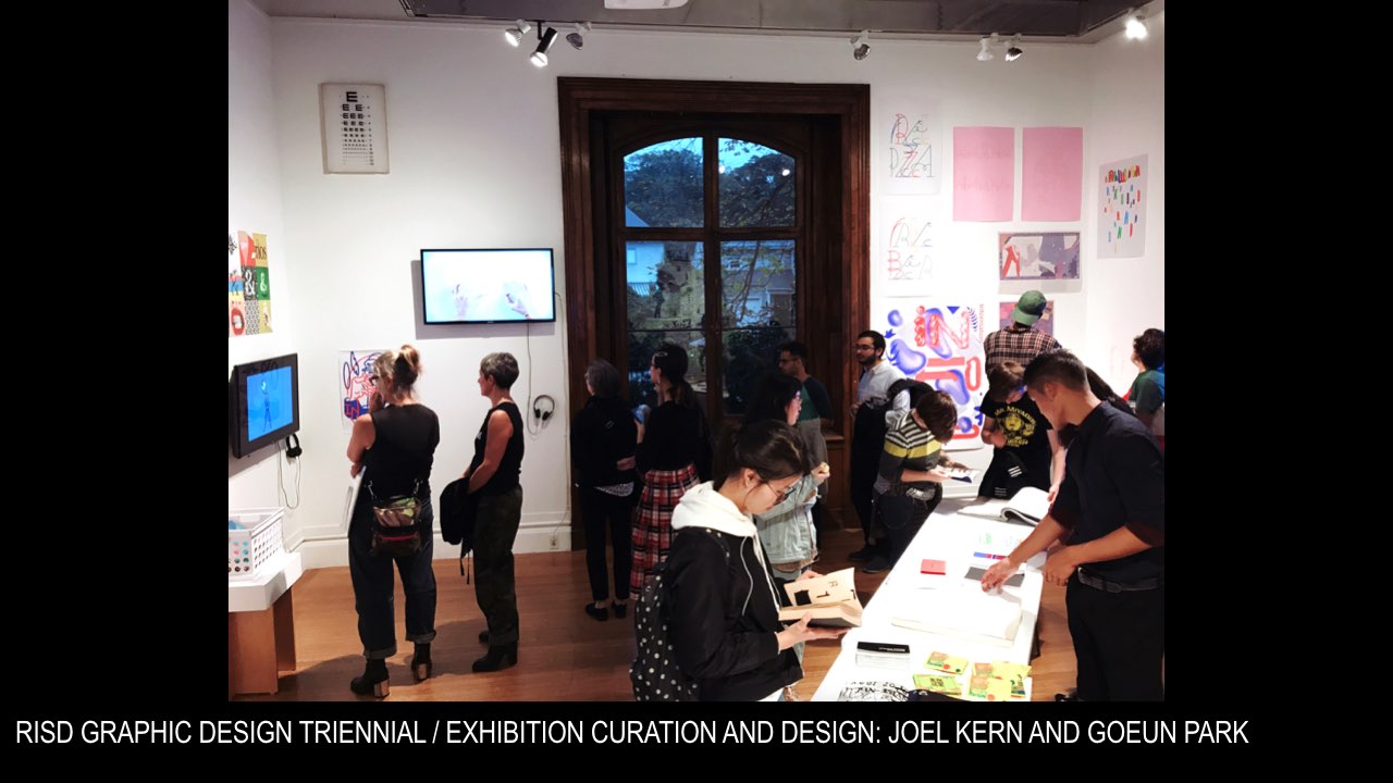
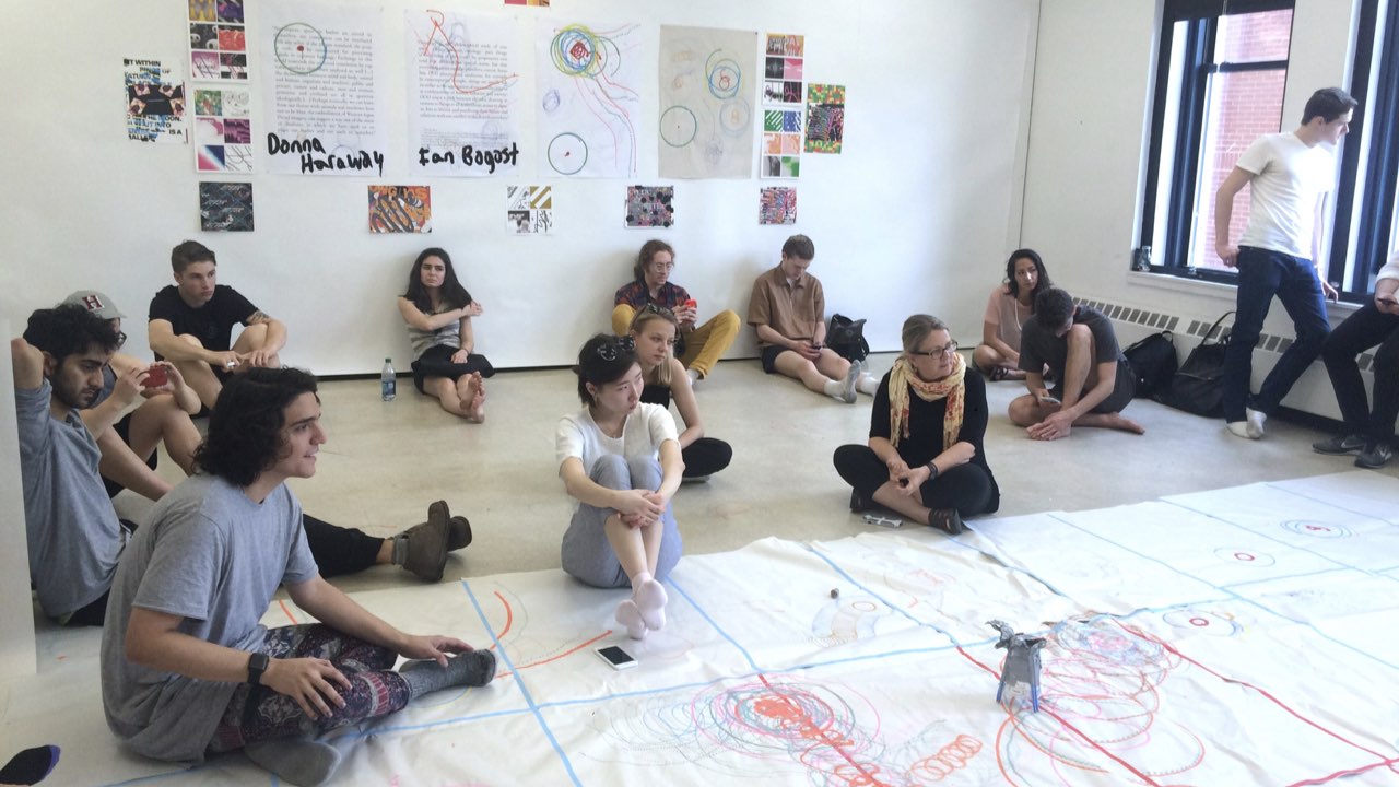
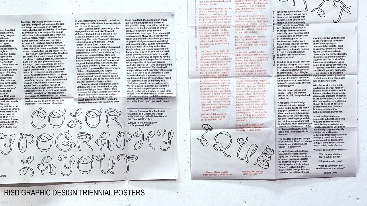
Recently, the graphic design department at the Rhode Island School of Design, where I teach, held its Triennial exhibition. It’s a major showcase for us, a slice through our department, where what we’ve accomplished is projected out into the RISD community for all to see. At this particular moment, I’m looking for evidence that students are preparing themselves to leave our school and continue some kind of good work, questioning all that they’ve learned, changing it, transforming culture by learning to produce it differently. The show was curated and designed by MFA students Joel Kern and Goeun Park.
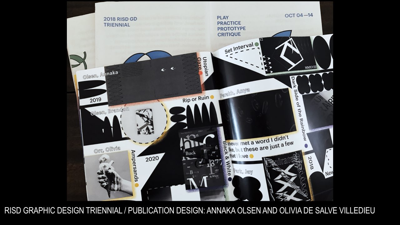
Our students produced a publication for the event, which includes a selection of writing by several graduate students, as well as one undergraduate. I knew that the publication had come together during the space of a week, and this by itself was of interest to me—that an urgent act of publishing was possible, at least in speed, and that these students knew how to get it done.
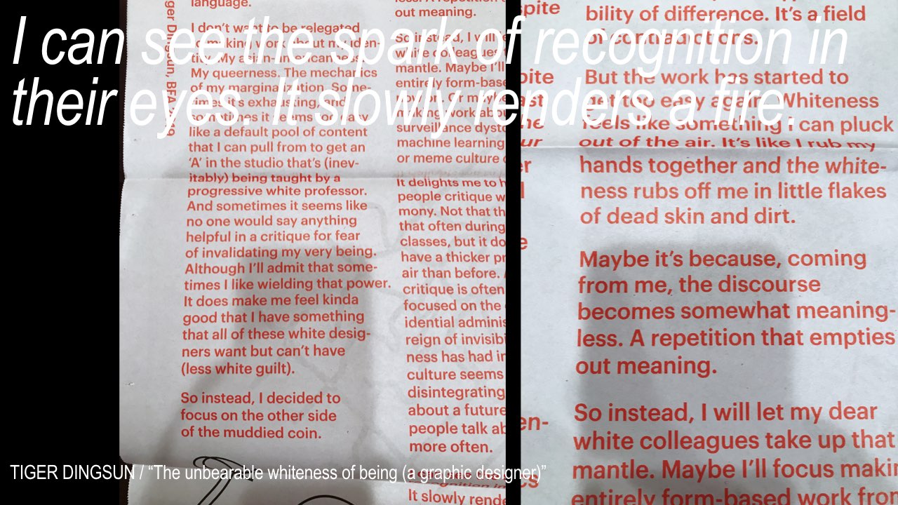
The only undergrad student whose writing was included in this urgent act of publishing was Tiger Dingsun. His short text was printed on a newsprint poster designed by MFA student Annaka Olsen, and it stopped me in my tracks. The text is titled “The unbearable whiteness of being (a graphic designer).” It’s powerful because it’s an unresolved provocation, a protest piece embedded within the show itself. My read is that it expresses a struggle, from the position of an Asian-American queer student at an art and design school, to find their own voice as a graphic designer in relation to personal identity and societal oppression. It’s an open expression of frustration, a self-reflection that’s trying to work something out.
The text describes a relational negotiation between student, work, and institution, between his own work produced in school and the white environment that both enables and resists it. The piece is a critique, submitted to an exhibition that had the stated theme of inclusiveness. In response to the show, the text seems to say: inclusivity isn’t enough. When will we talk about whiteness and the white culture we operate in. It includes an expression of hope that white people will take on more of the work of critiquing white hegemony. Tiger says he sees “the spark of self-recognition in their eyes; it slowly renders a fire.”
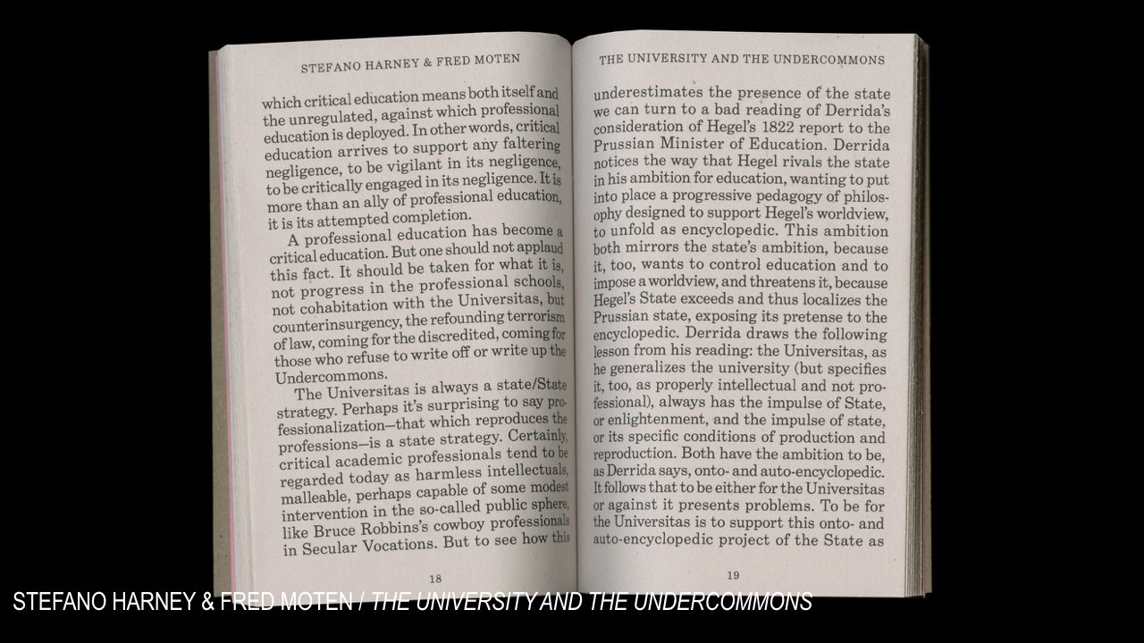
I think of Fred Moten and Stefano Harney’s concept of the undercommons here, specifically this thought: that the undercommons is a place for subversive intellectuals to send out signals, to find each other and imagine new ways of seeing the future. And that in the undercommons the only relationship one can have to the university is to steal from it. To be in it, without being of it, and to actively use the institution’s resources without giving in to its values, which are inevitably tied up in complex histories of bias and profit. It’s a position I’m trying to sketch out myself, and I’m on the lookout for that recognition, both the self-recognition that slowly renders a fire in the eyes, as well as seeing, and acknowledging, those students who aren’t satisfied with the conventions of a good art and design education, on the lookout for others, peers, students—others out there in our queer orbits, trying to find their way through muddy waters.
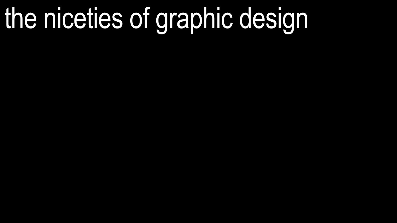
I frequently confess to students that I’m not there to teach them anything, that we can learn from each other. I mention this particular critical text because it’s a sharp moment where I can admit to being energized, because a student coming out of our program (although any program, really) is doing this kind of digging, in a way that pierces the niceties of graphic design. So I’m hopeful, as Tiger says he is, but I’m also challenged, maybe directly so, to look back into my own eyes, and the eyes of my colleagues, as he suggests, to self-recognize within the institution, my own position and role as a white faculty member at a private art and design school in New England.
And I think: this is the best that an urgent act of publishing can do—to show up, to make an appearance in public, provoke, question established positions, and energize others. Not simply an affect or an appearance of good design, but discourse that digs, that stays in the eyes, long enough to start a fire. Discourse that asks us to read differently. Here, in this particular context, I ask myself directly: is my own work doing anything. Is it urgent enough? Is it grounded in, or in dialogue with, or foregrounded by crisis? Does it resist oppression in any way? Does it provide a platform for others who speak, write, or create from historically marginalized positions to express their points of view?
Where exactly does my own self-recognition expose itself—does my work allow it?
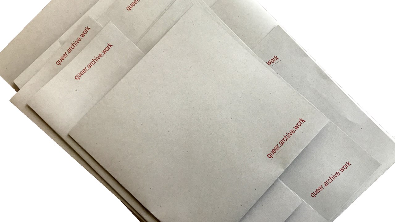
These questions make demands. These are demands that are evolving, demands I’m making of myself, and of the communities with which I engage. They don’t answer these questions, far from it. But they may allow for new kinds of work to happen. In this spirit, QUEER.ARCHIVE.WORK is a publication framed by these demands, which I believe are becoming more and more central to any discussion of urgent publishing, queer publishing, queering design, and what publishing as practice as resistance might mean.
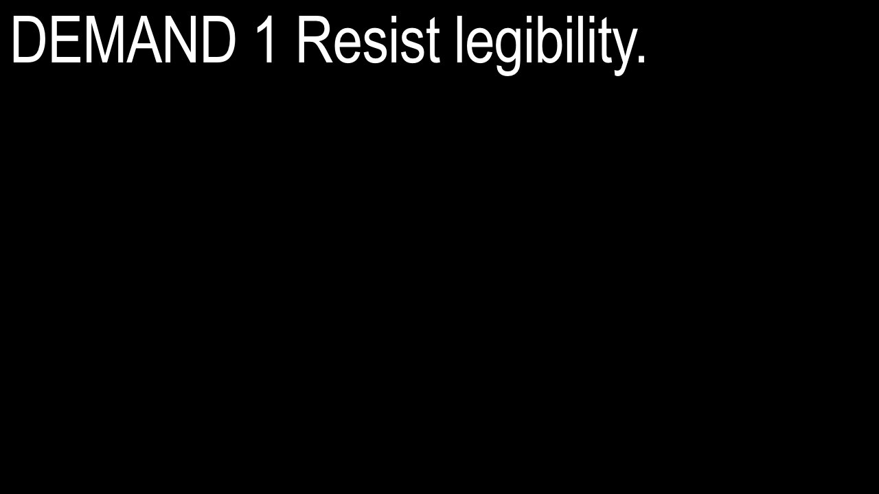
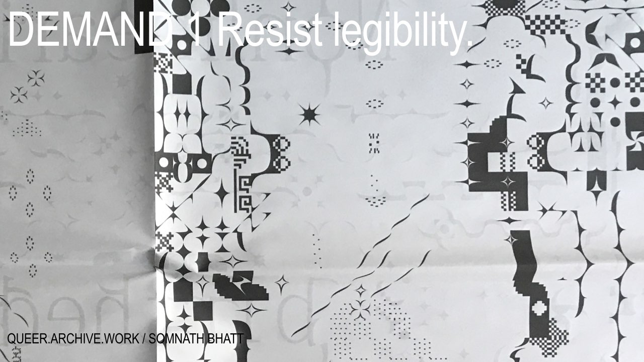
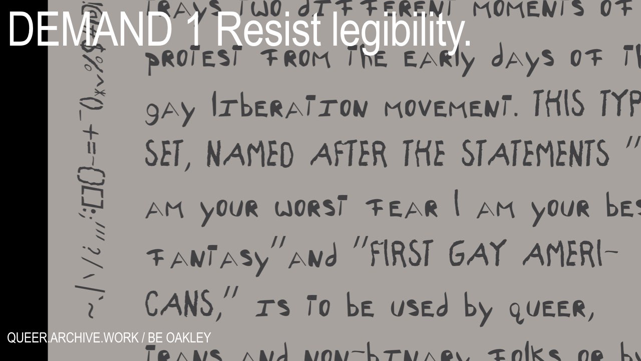
DEMAND 1 Resist legibility.
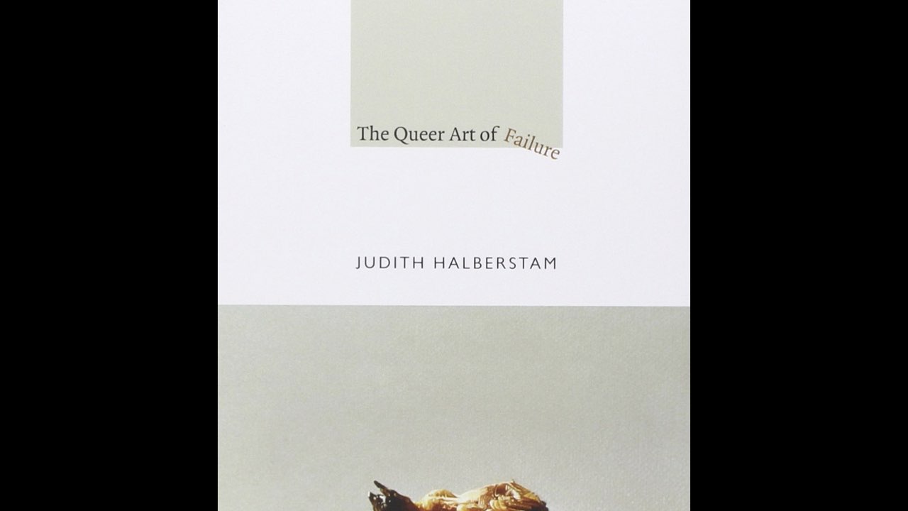
This is an idea that I’m taking from Jack Halberstam, one of the contributors to QUEER.ARCHIVE.WORK, and the author of The Queer Art of Failure, as well as the introduction to Fred and Stefano’s book The Undercommons: Fugitive Planning & Black Study.
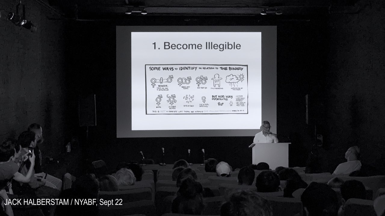
In an event that I organized at MoMAPS1 for the 2018 NY Art Book Fair, Jack declared it in this way: Become illegible. He spoke about this in relation to gender fluidity, ways of being outside the gender binary and cisnormativity, structures that are so firmly established in language and culture. And I’ve been thinking about how our surveillant state wants more and more to “read” our bodies clearly, reading us as agents of capital, as consumers, as laborers, as profit-producers—reading our faces and our bodies as clearly seen targets.
To remove clarity from reading is an intriguing strategy; it’s different from camouflage. It’s not necessarily about visibility, or becoming invisible, or hiding—the demand asks that we resist the capacity to be read clearly, as a political position. And this is a demand that’s difficult for me to make as a professor of graphic design—is it something I could ever possibly teach? Isn’t it in direct conflict with the canon and legacy of good design and communications?
What if we take this all the way, and talk about illegibility as a design strategy. I’m not sure it’s a valid idea, but I want to test it.
The clarity of a binary structure is an illusion. Rather than insisting on clarity we could go the other way, and expand the illusion. What would it mean to design a text using this strategy? Is there room in our vertiginous condition for illegibility, at a moment when truth is more and more difficult to recognize?
I think so. I imagine what it would be like to publish a text that can’t be ranked by google, or stored on dropbox, or hosted by godaddy. Or a collection of texts that can’t be read in any one order, or from any one perspective. The idea of bad typography, and no dominant read, reading that isn’t fixed. A variety of reads that are all equally valid.
In a recent conversation with Nick Konrad, one of my students, he called it “messy legibility.” Messy sense-making.
So maybe resisting legibility means encouraging—or creating—new kinds of reading. Close reading, imperfect, difficult reading, messy reading.
That brings me to the second demand.
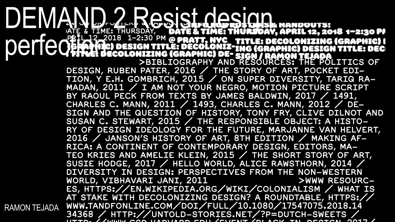
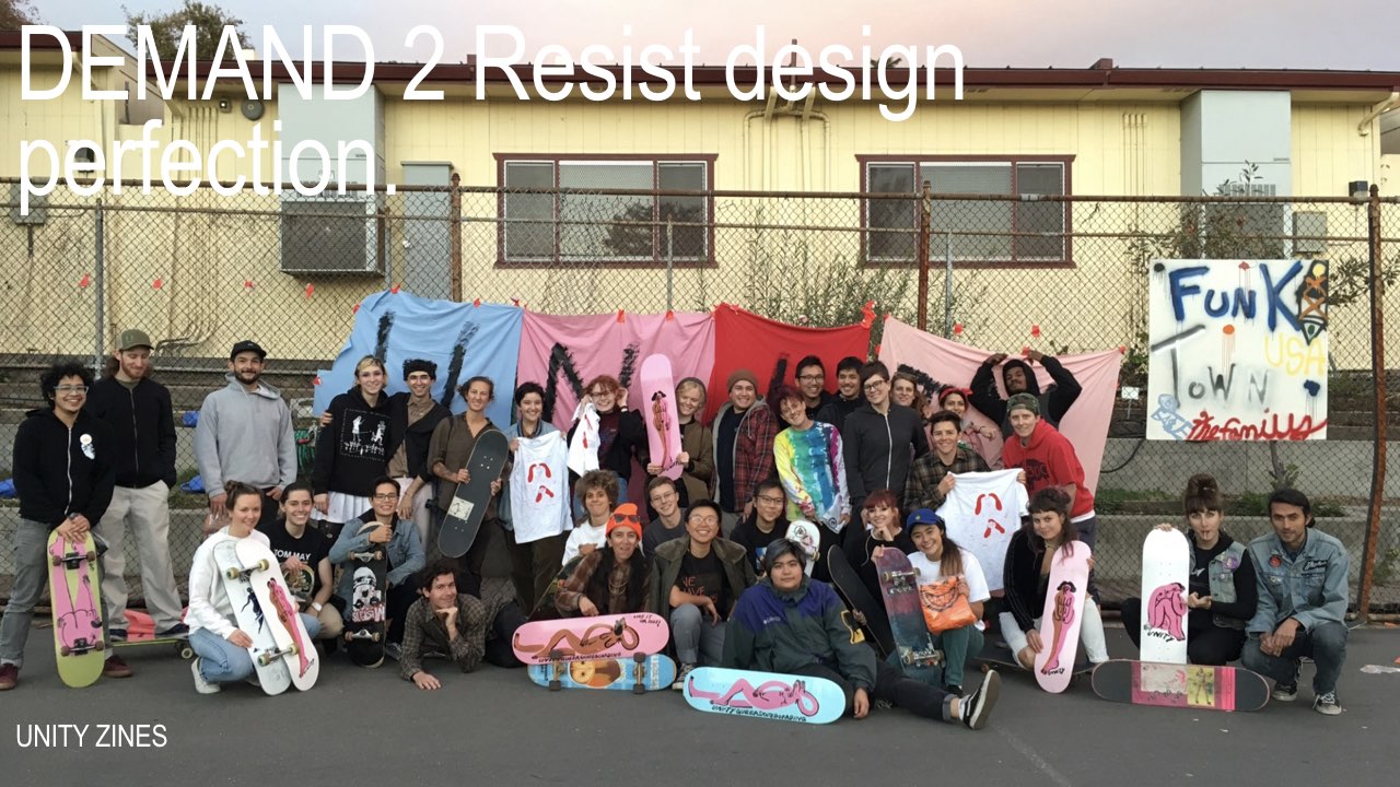
DEMAND 2 Resist design perfection.
What kind of design strategies would we explore, or teach, to allow for the resistance of legibility? If we begin with legibility itself, designing for the perfect read means optimizing typographic structures and details in order to convey a preferred meaning. I think of hierarchy, and the most basic and accepted notions of understanding language that come from signaling the prioritization of one notion over another through a series of intentional design decisions.
The idea of constructing importance through the use of hierarchy. Wherever we can do this, we create the conditions for bias. A reading experience that doesn’t affirm hierarchy and notions of the subordinate, meaning that no author or artist exists in a secondary position—this is actually quite unusual. It’s difficult to find examples.
What would it look like to maybe not do away with hierarchy, but to explore it intentionally, to subvert it, to create a space—the space of a publication, or a page, or within a browser—where hierarchical demands aren’t as expected. Where the reader or viewer is given the agency to wander, to float, to make different kinds of decisions about where to look first. To arrive at a kind of understanding that isn’t based on rank and authority.
I also think of the craft in typography, and the emphasis we place on making language look good for optimal legibility. I enjoy a properly spaced word like anyone else. But if we kern—to space the letters—towards perfection (that’s what we teach), we’re striving for some ideal version of how language should present itself.
To correct the software and adjust for abled viewing, without gaps or odd letter combinations that take away from a clear, linear notion of understanding. I’d like to resist kerning. Is it possible that the un-kerned word is a queer word, a word that refuses to conform to western standards of correctness and good typography?
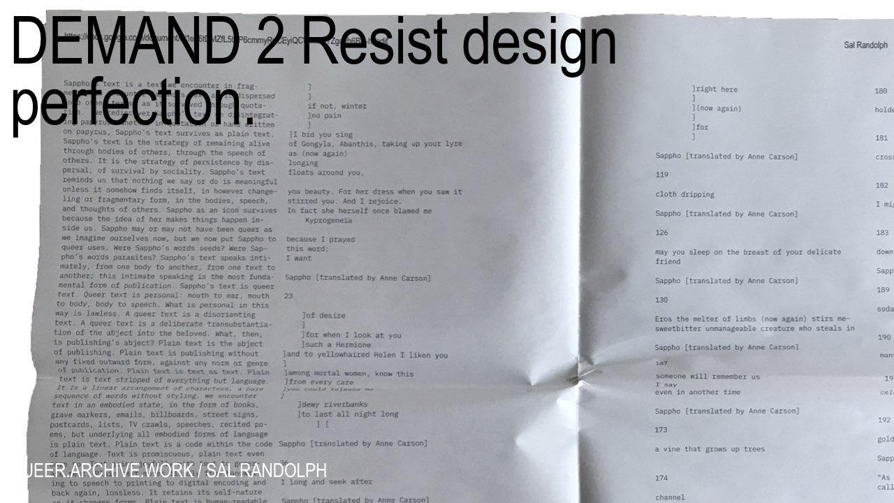
Sal Randolph, in this first issue of QUEER.ARCHIVE.WORK, writes that plain text is queer text. Ungarnished language that resists normative conventions and legacy systems. This makes so much sense to me. Plain text, unkerned text, text that works on its reader without the assertion of importance and hierarchy, and all of the legacy design values that come along with so-called correct design. I’m talking about how we train ourselves, and our students, to fall into place with normative design conventions, decisions based on conformity, assumptions about what constitutes good, consistent reading.
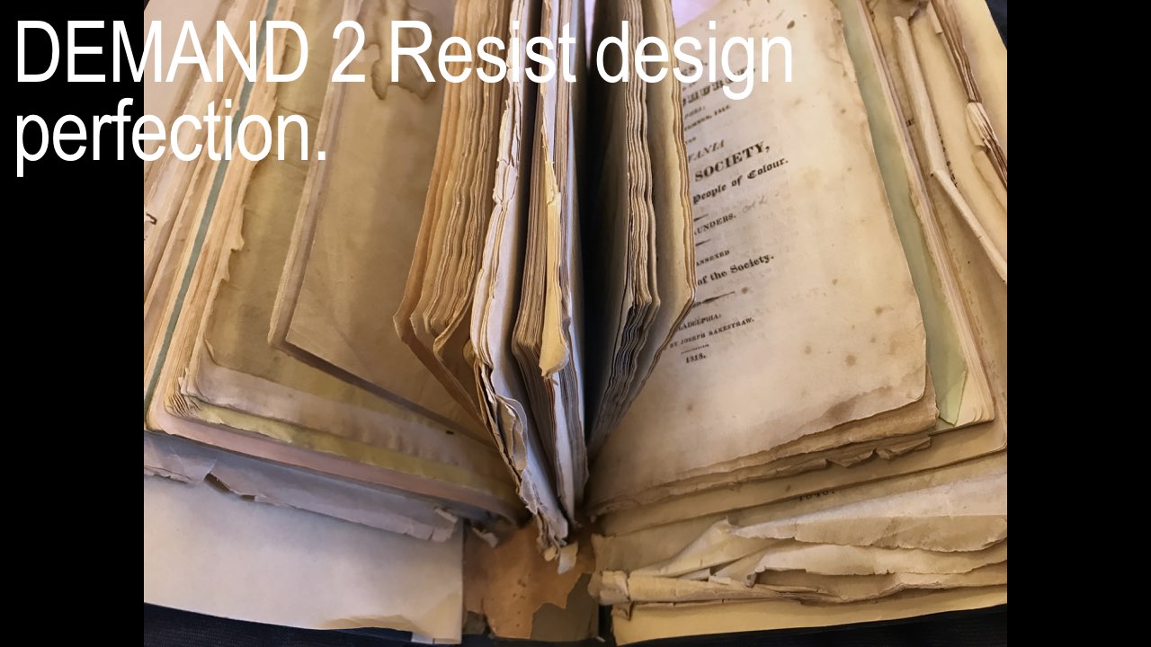
I’m also particularly interested in how binding works to maintain legacy systems of hierarchical distinction, and the fixed read. To bind materials together is to fix them, to physically tie parts together so that they can’t separate and become undone. To resist binding might mean to let different texts, authors, and perspectives intermingle, for order and authority to shift as the direction of reading changes.
It may even mean that individual pages or sheets can loosen, and come undone—I mean this literally, but also affectively—to change the read. The flexibility of the unbound folio, or the loose assemblage, isn’t such a radical notion.
We can find several examples in the history of the artist’s book where the reader is given more agency, to re-author the text. But how might we take this out of the realm of the alternative or the precious, exploring the loose assemblage as a political move as well as an artistic one—to loosen hegemonic order.

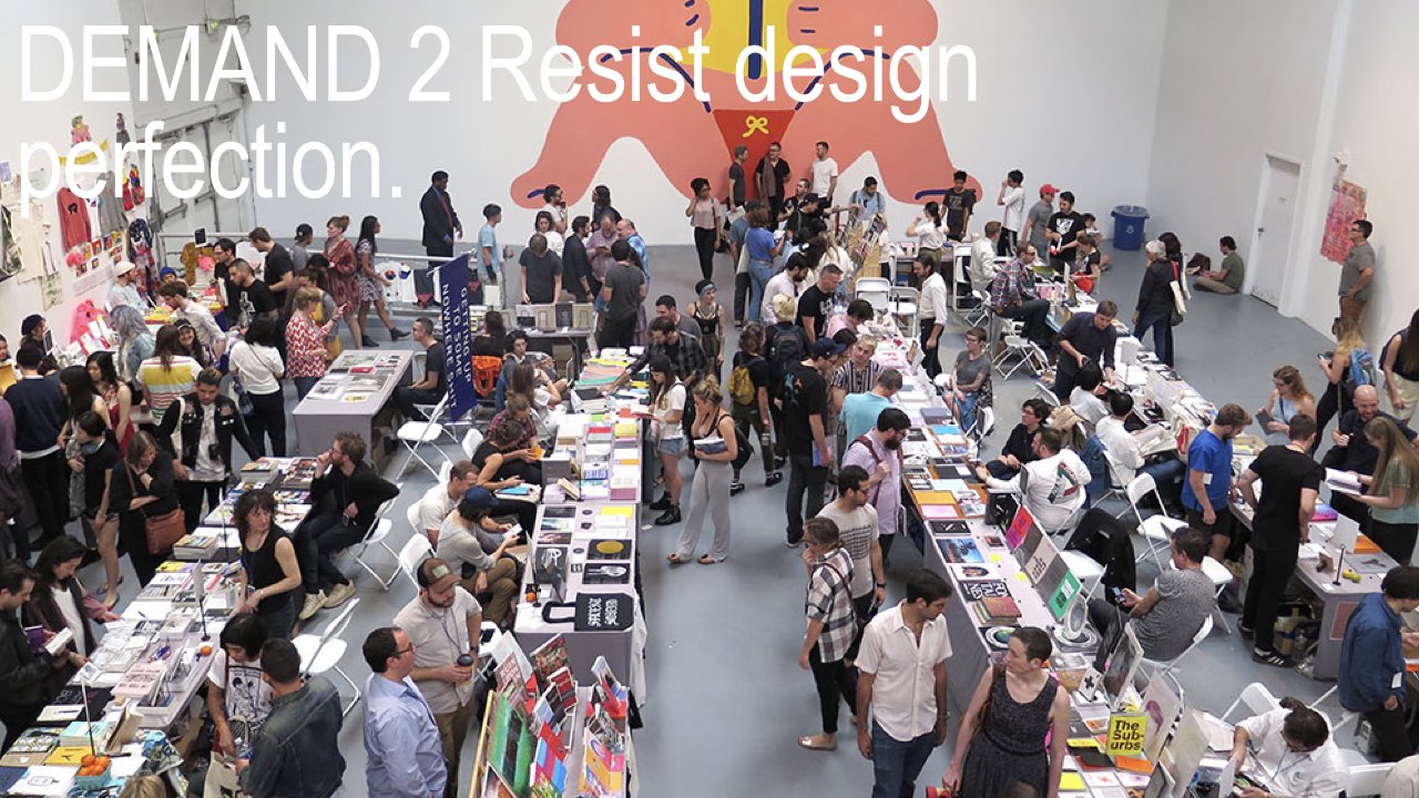
I’m also reminded that this is what we revere today as the pinnacle of design perfection. It’s also where we do a lot of our reading. The richest company in the world has asserted its design ideology into everyone’s pockets, giving us new standards for craft that seem other-worldly, even non-human. I don’t think it’s any accident that the DIY culture of art book fairs and artistic self-publishing has exploded in the last ten years, following the mass introduction of an aesthetic like this one in 2007.
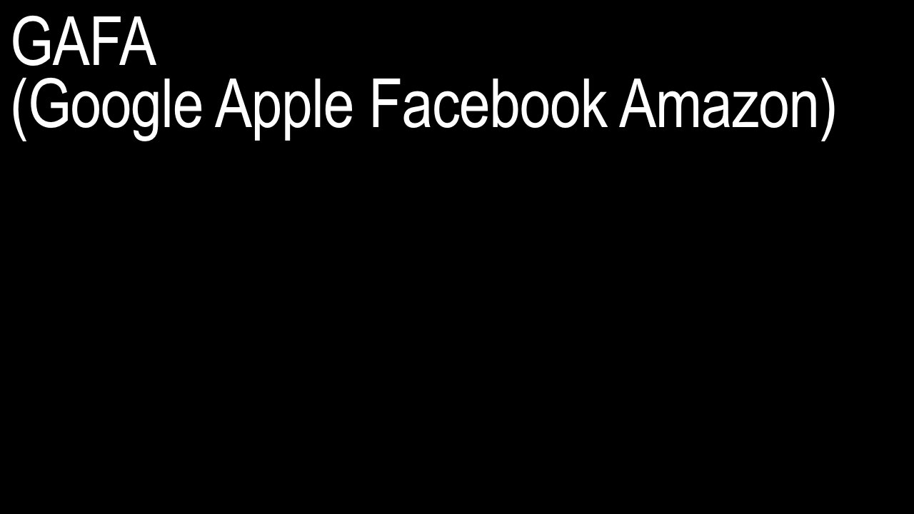
GAFA (Google Facebook Apple Amazon) came into power during this time, and entirely new design industries, like user interface and user experience design, have been valorized and absorbed into art and design schools to feed the enormous workforce that’s needed to maintain a design ideology based on perfection at all costs.
I’d like to argue that there’s another kind of craft to be found in urgency, different from what we think of as the work of the artist’s hand, at one extreme, and tech-utopia’s marketing of craft as an almost non-human magic, at the other. What does urgent craft feel like? Perhaps it’s found somewhere in the artist’s ability to produce and amplify independently, under crisis conditions, without corporate or institutional support. In the agility and flexibility needed to deliver messages that reflect an author’s immediate context, like Tiger’s text, written in just a couple of days.
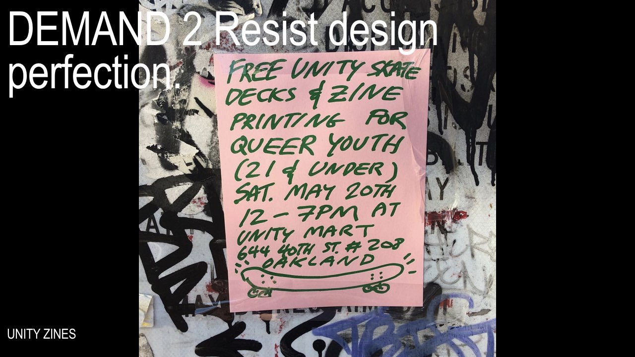
It might mean shifting design skills from smooth web-based services, like print-on-demand, to messier artist-controlled skills, like risograph and silkscreening, both of these being easy, cheap, high-quality, ink-on-substrate methods for reproducing text and image. And to acknowledge that queer environments might require new kinds of reading.
Maybe it’s about re-prioritizing design decisions to focus on who is being included in art and design conversations, and how to more openly access their work, rather than what it looks like. The sociality of design—artist-controlled, collaborative, and peer-to-peer initiatives that bring artists and writers into direct contact with each other—a network of relations that’s focused on ideas, discourse, and the present moment.
DEMAND 3 Publish radically.
Finally, I believe that we need more radical publishing.
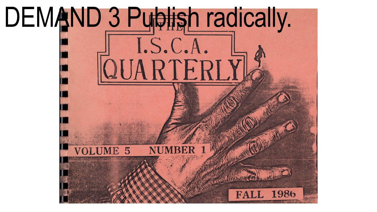
In the past, radical publishing might have meant radical in form, like the work of the International Society of Copier Artists, founded in the early 1980s.
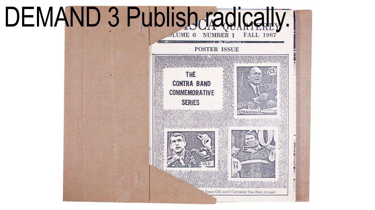
They used the photocopy machine as a way to gather a community of artists into loose editions,
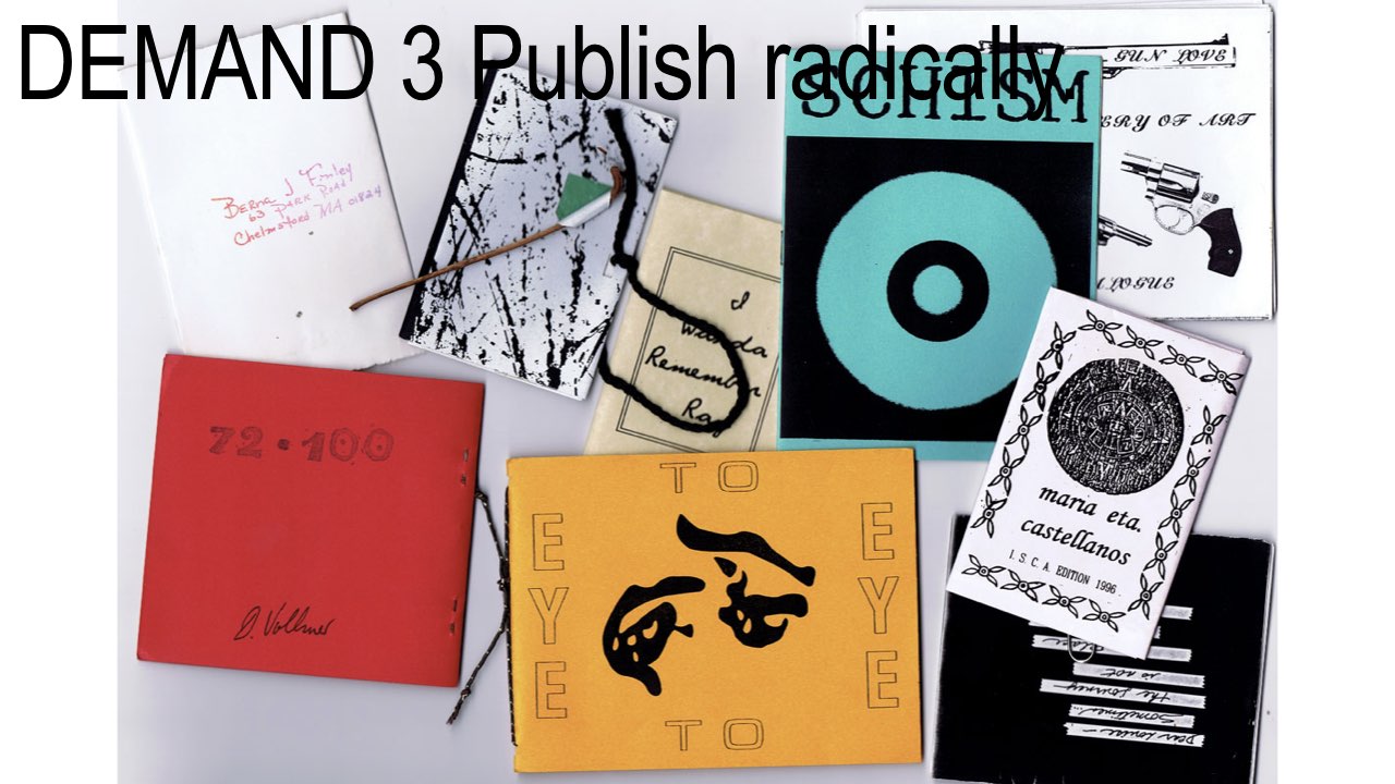
which were published in boxes, envelopes, and bound books. Or even today, with Wikipedia, which redefines the encyclopedia completely, in form, authorship, and distribution.
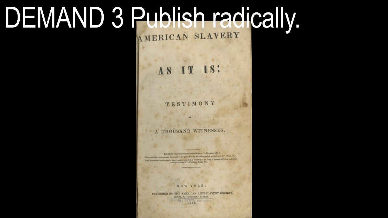
Of course, there’s a long history of radical content being published as a means towards change, like abolitionist pamphlets that were published by activists in the first half of the 19th century,
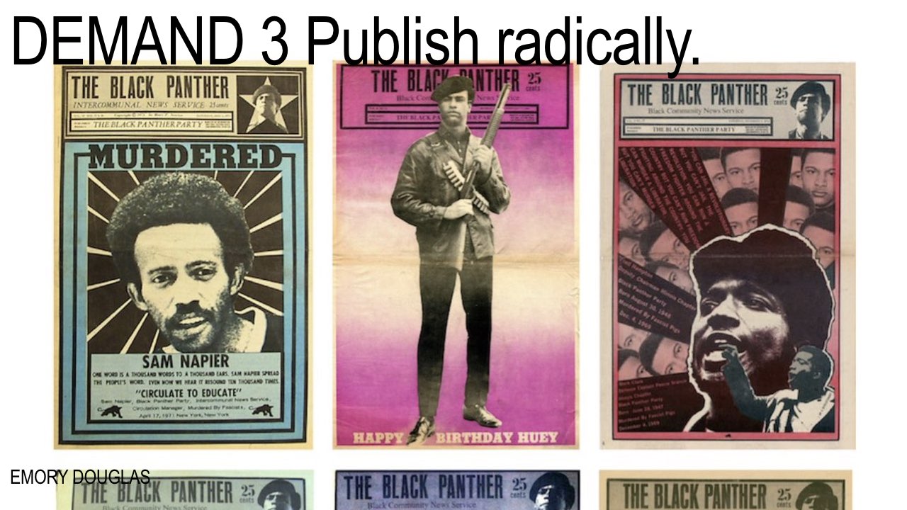
and Emory Douglas’s Black Panther newspaper in the late 1960s.
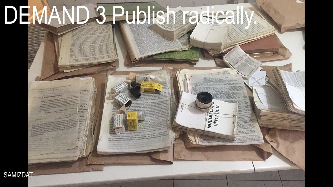
As well as publishing that’s radical in its distribution, like the samizdat books that circulated banned texts in the former Soviet Union, hand-written and hand-typed, passed along, peer-to-peer in totally secrecy, networks that could never be fully identified.
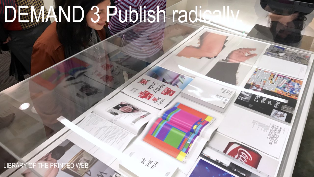
Internet culture felt radical for awhile. My project Library of the Printed Web was a way to catalogue that fascination, but appropriation and the circulation of images has become so mainstream that the manipulation of messages as they travel through the network is now our default condition,
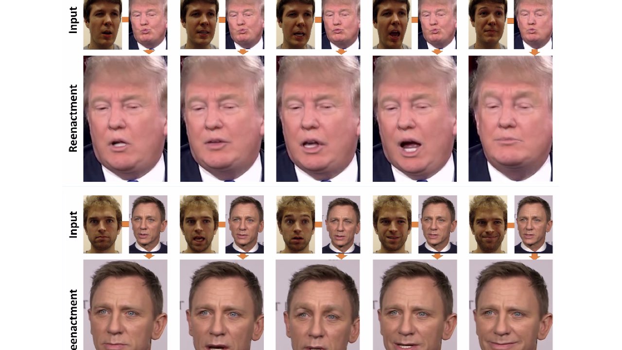
no longer the work of artistic practice but a popularized, meme-ified expectation that contributes to the overwhelming spiral of deep fakes and deep distrust. Perhaps the most stunning use of the internet right now isn’t avant-garde or artistic at all, but the radicalized position of the President of the United States, along with other authoritarian right-wing voices in the world, using popular social media platforms, the same ones we use, to shape mass opinion.
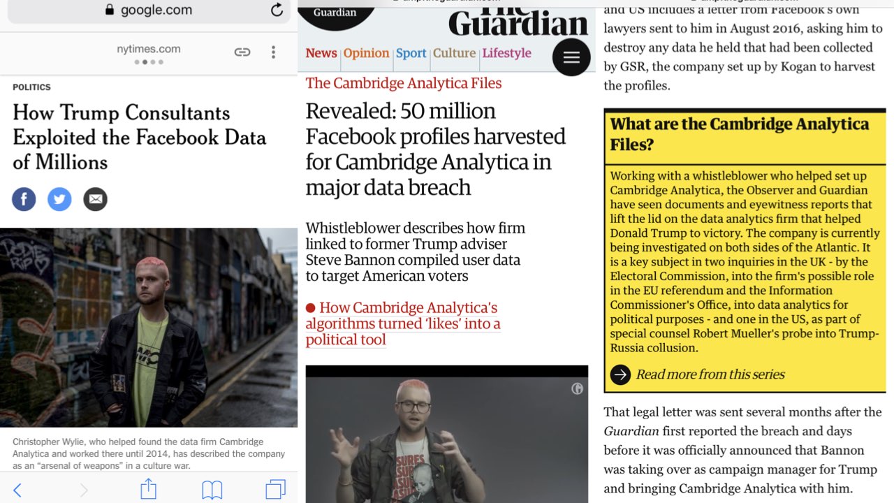
On the other hand, I see whistleblowers performing truly radical acts of publishing that weren’t possible before the internet, at least not in the same way, confusing the private/public binary in all senses with leaks that expose information to new audiences and change our understanding of hegemonic power. These are urgent acts that shift the balance by pulling the binary apart—the leak as a queer act, allowing information to flow in new, unexpected directions, the surprise conversion from private to public. The leak allows for a different kind of reading—a closer read that’s only possible by making a mess, a chaotic rearranging of status and power simply by shifting positions.
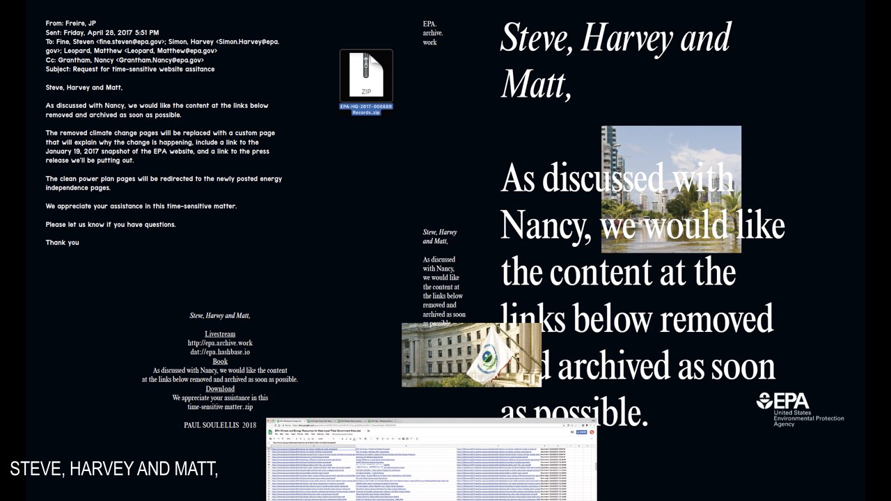
I tried to explore this in Steve, Harvey and Matt, a project that takes the form of a livestream, a book, and a download, earlier this year. It’s focused on the weekend in April 2017 when the EPA deleted almost 2,000 web pages having to do with climate change from their website, EPA.gov. This is where I started to think about queering the artist’s publication, to decenter myself as an artist and put the emphasis on messy action, a meaningful act that tries to re-write the narrative of climate change discourse, while re-activating the archive of lost web pages in a messy, futile, and “illegible” way. It’s an archive in pieces, and it doesn’t really work as an archive at all, but it tells a compelling story of failure.
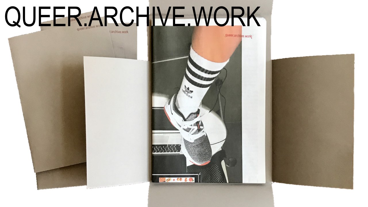
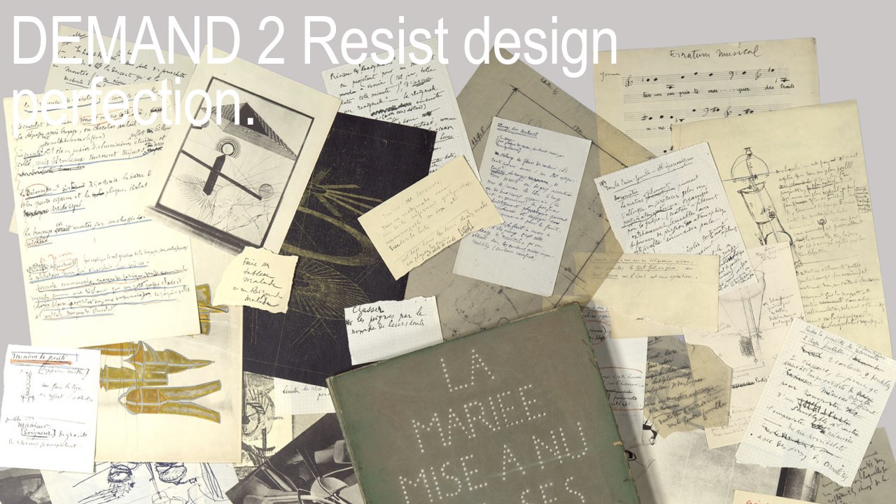
My latest project, which launched at the NY Art Book Fair a few weeks ago as well as here this weekend, sets another stage for these demands. QUEER.ARCHIVE.WORK is a place to gather and to experiment, to ask: what does queer publishing feel like right now. Gay, lesbian, transgender, people of color, and other historically marginalized positions have frequently been left out of archives, rendered invisible in cultural discourse, because of homophobia and neglect, so my aim is to work with artists and writers to bring queer perspectives into view—not as an alternative, but as fact. To make this work visible in the present, and let it mingle, and to enable and construct new relationships between artists.
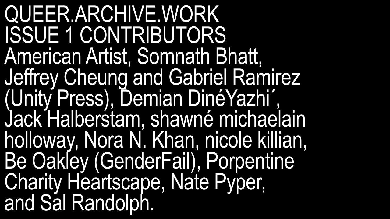
I invited these 13 contributors because I felt that each was working with some kind of queer methodology, trying to subvert normative narratives by writing or imaging in a different way.
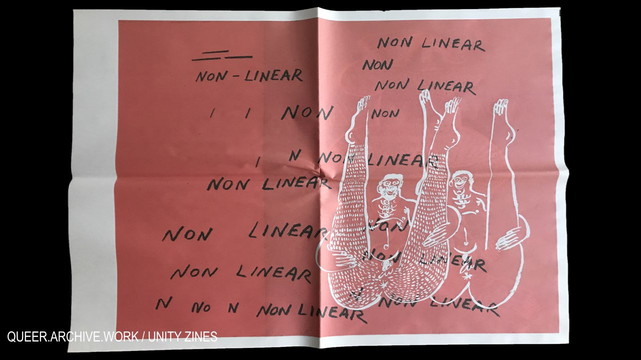
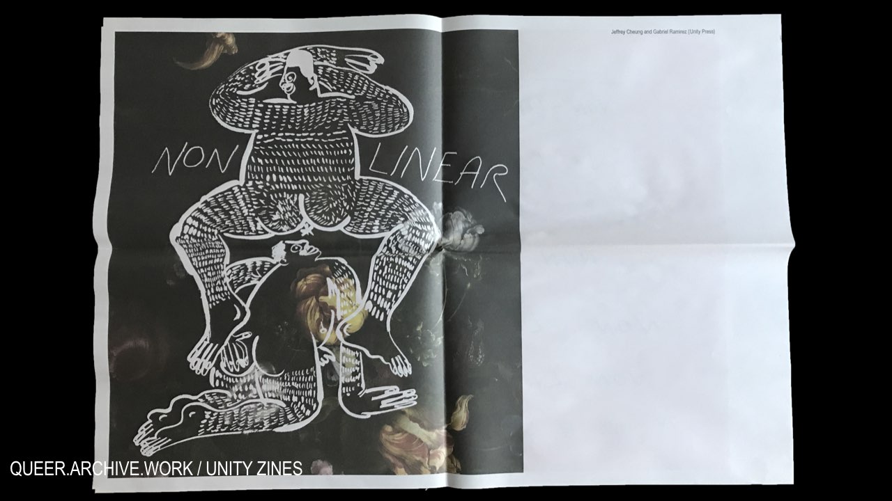
Several of the works call out non-linearity, like these images by Unity Press
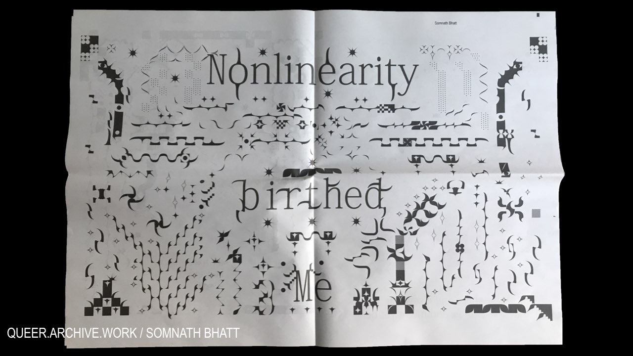
and this one by Somnath Bhatt.
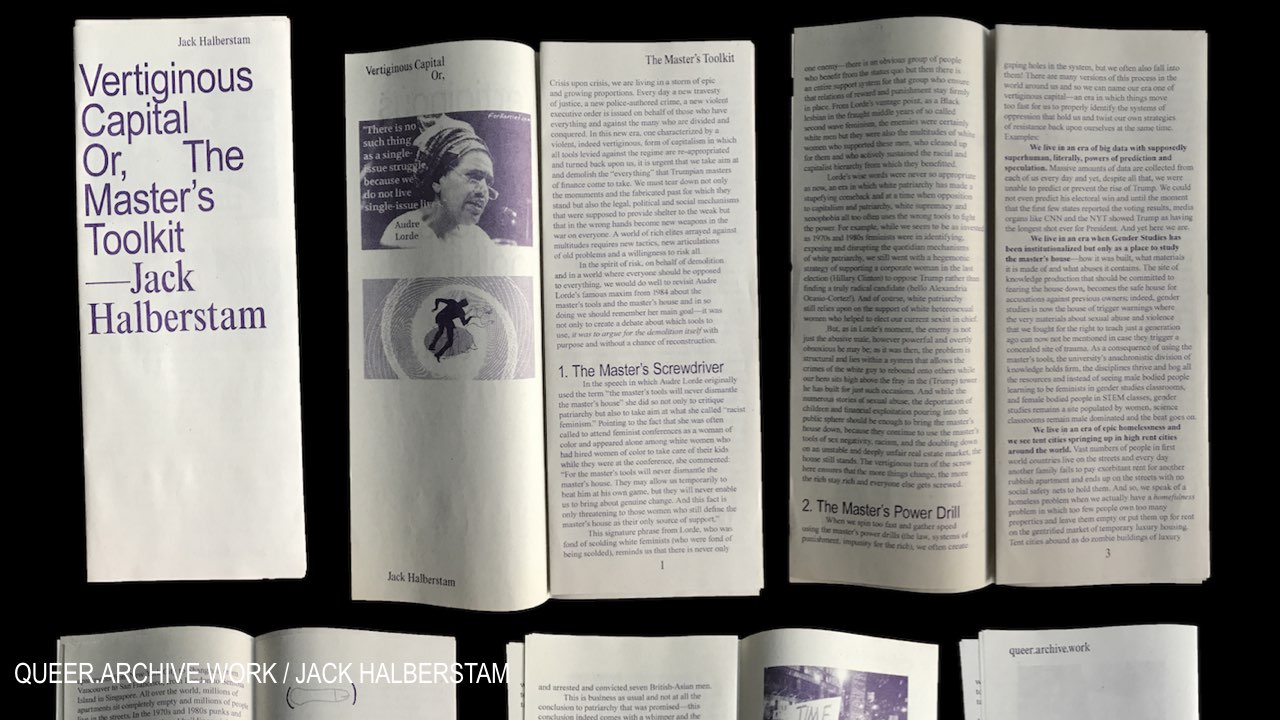
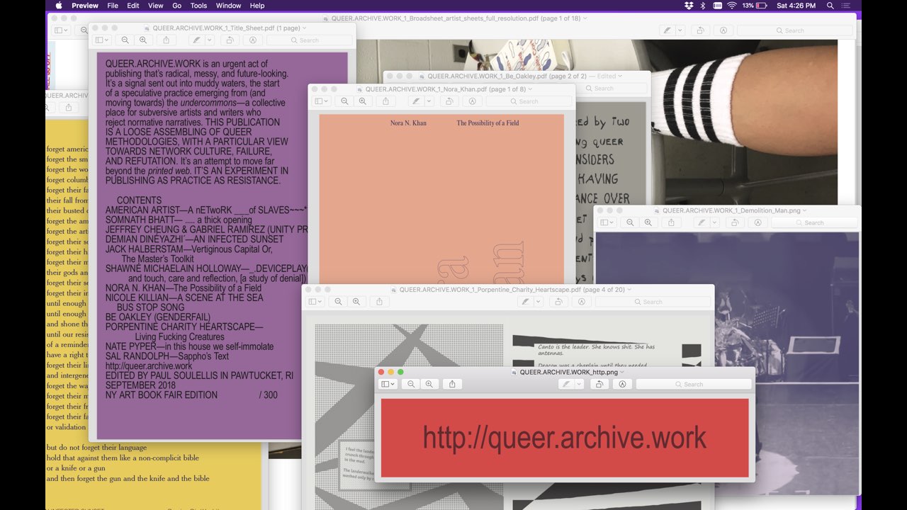
What’s striking is that several of the contributions evoke destruction—like Jack Halbertstam’s call to arms, using Grace Jones as Demolition Man, and Gordon Matta-Clark’s work, to ask us not to work for the improvement of existing systems, but rather to tear it all down, to dismantle the master’s house.
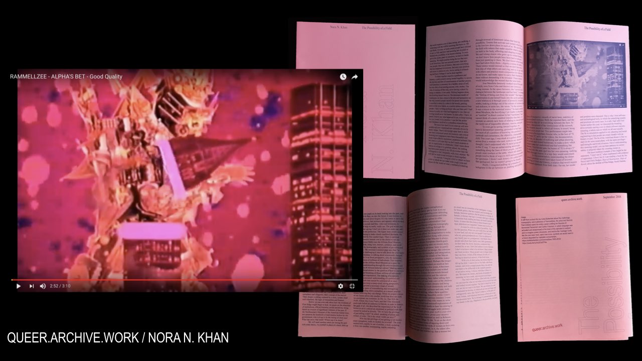
And Nora Khan’s essay “The Possibility of a Field,” on misreading, caulking eyes, seeing inward, and creating new icons to reverse normative values; she conjures up the artist Rammellzee and his destruction of a cityscape to illustrate the text.
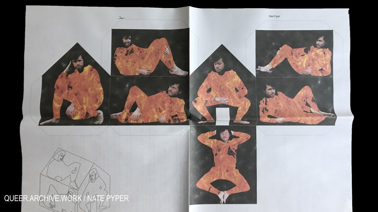
Nate Pyper’s self-immolation, visualized as a burning body wrapped around a house,
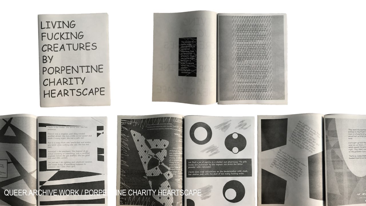
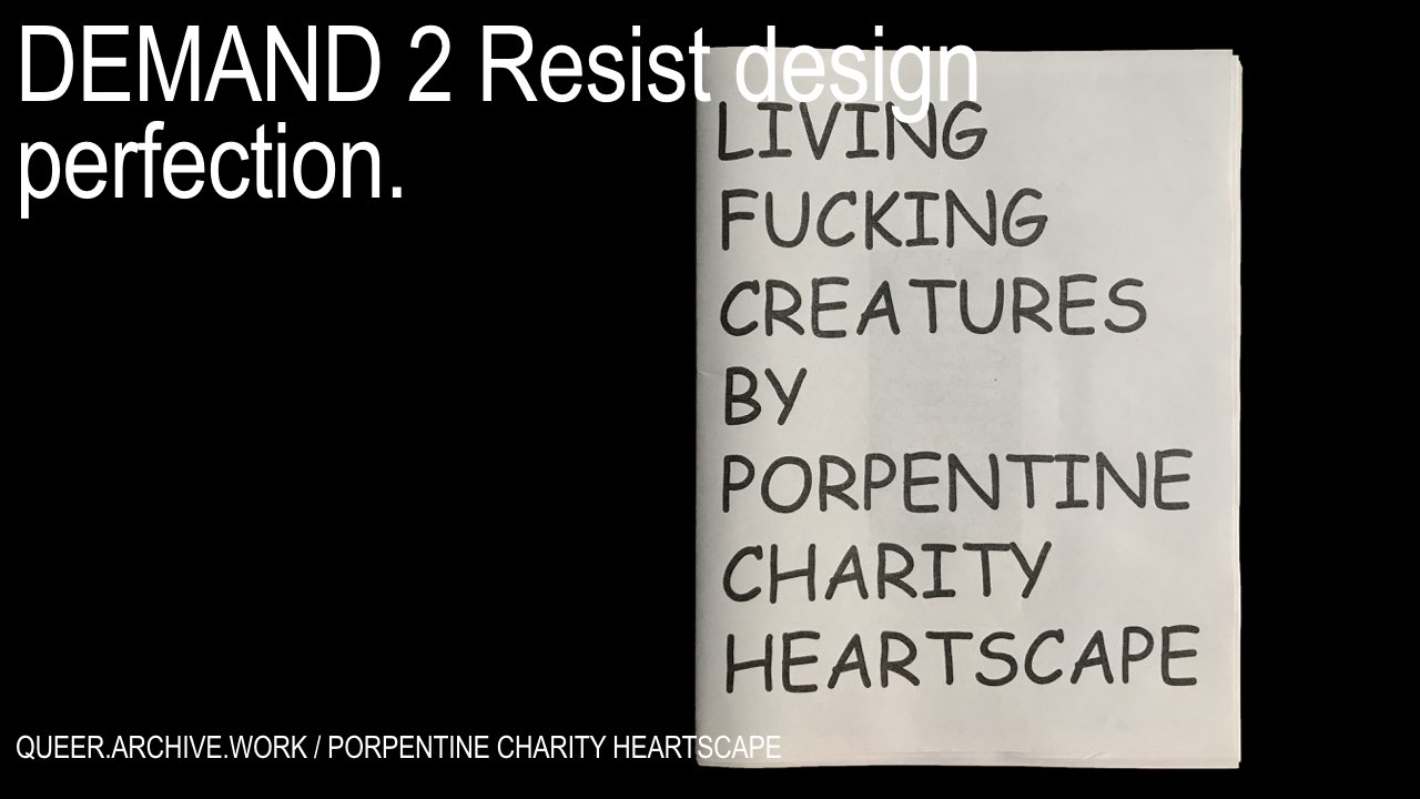
and Porpentine Charity Heartscape’s surreal and violent gamescape.
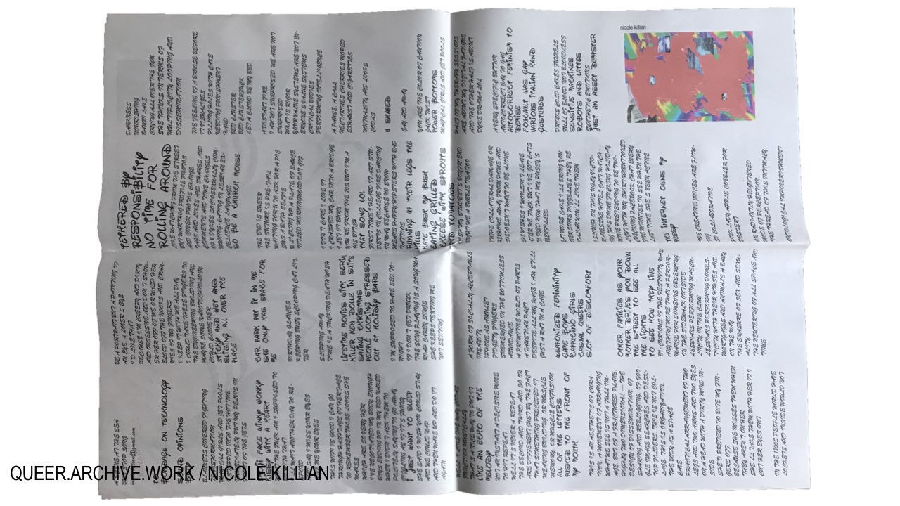
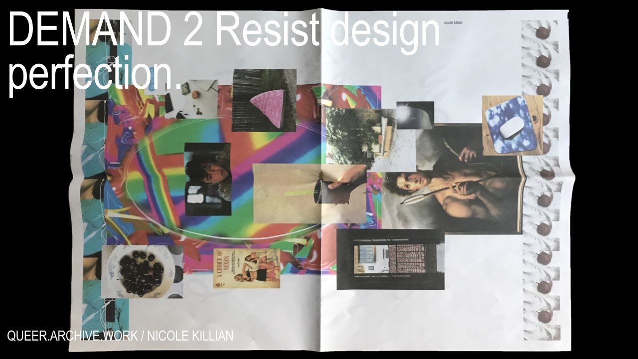
Messy legibility is everywhere in this issue, visibly so in Nicole Killian’s full-page broadsheet rendered in all caps, in the fonts Brush Script and Walter. Nicole’s text can be read, but not easily. The typography asks us to work harder, to focus, to commit to a different kind of reading. It may also be saying that it’s not for everyone to read.
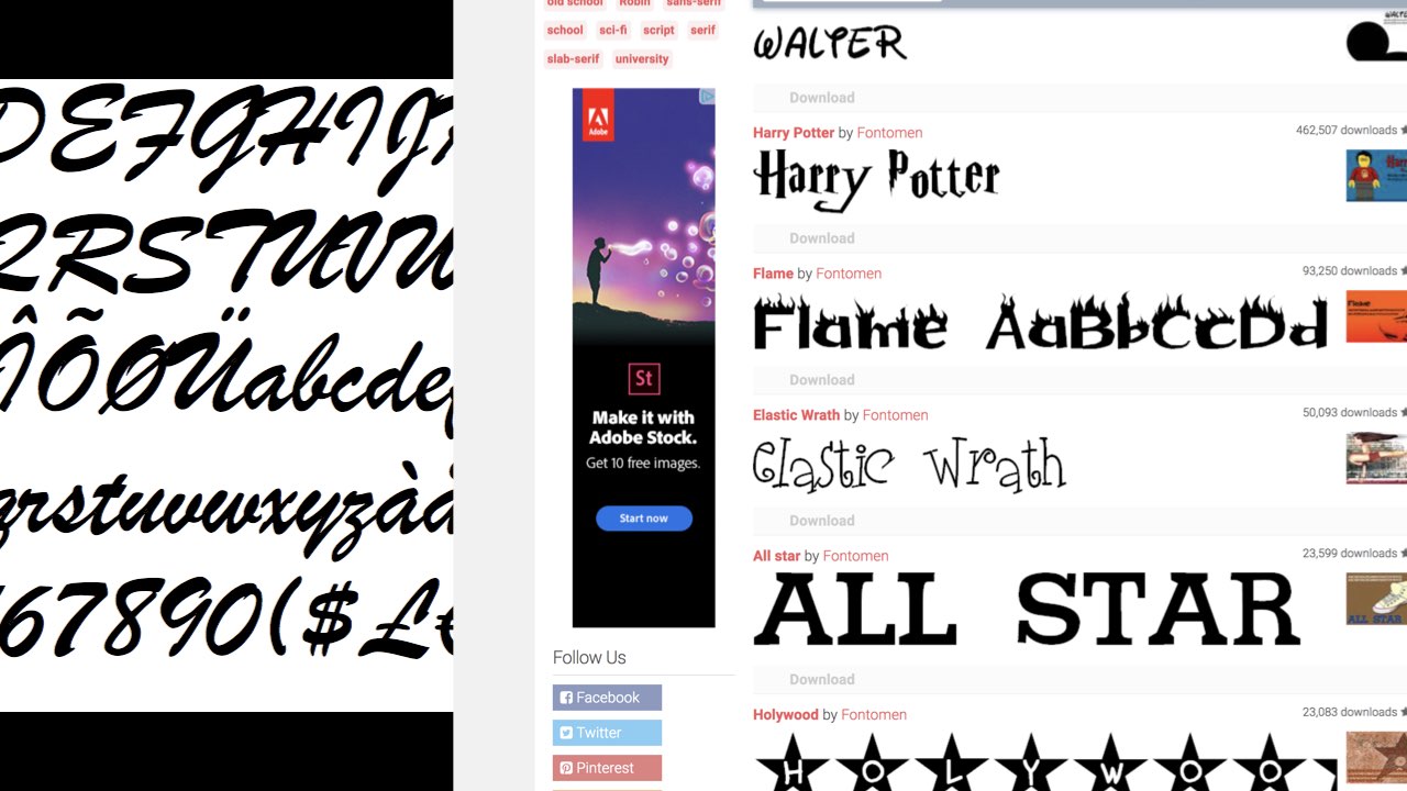
The Walter font comes from a 2001 collection by Fontomen, who also designed these beauties. This is weird, bad typography, it’s kitsch here in this context—
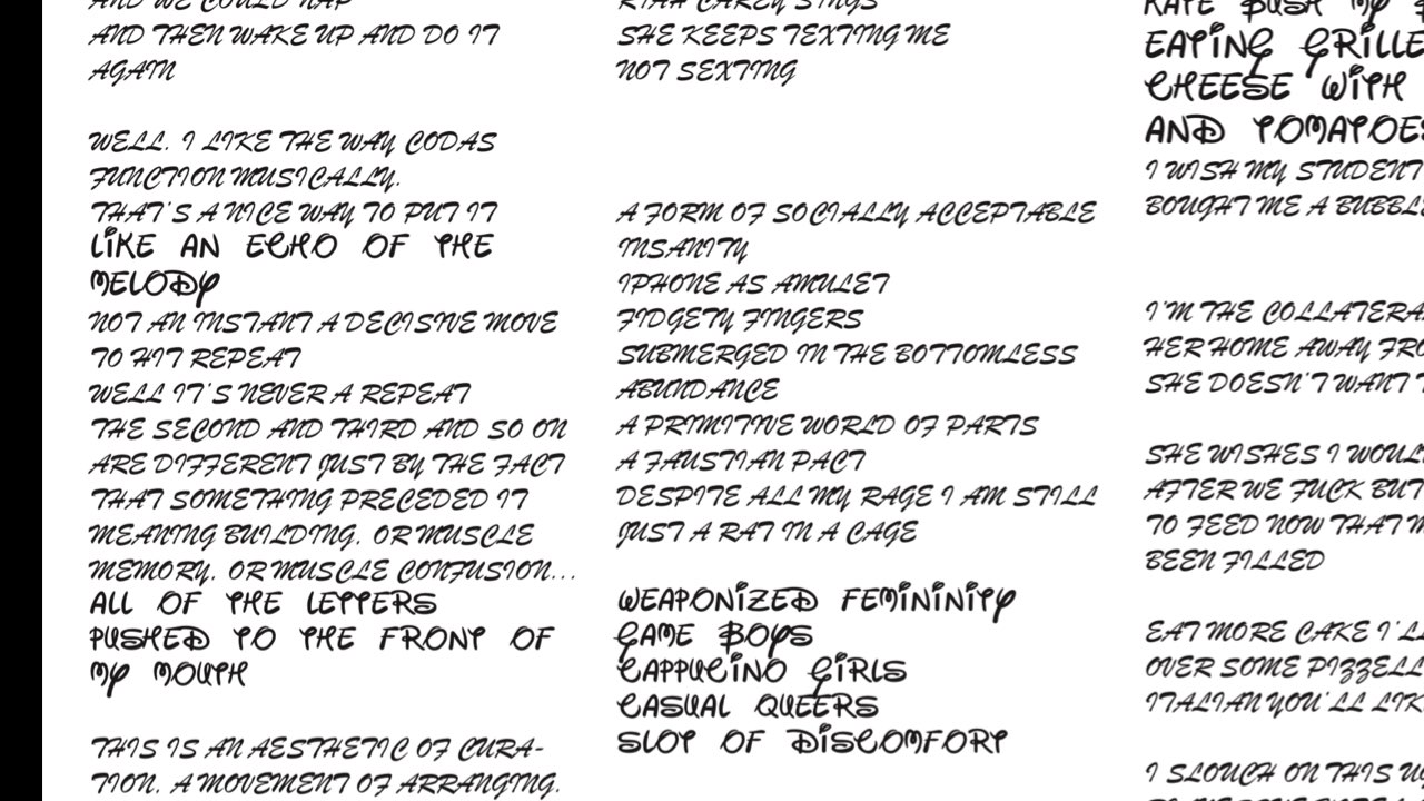
but not at all here, where Nicole uses it to set her iphone poetry. She mixes corporate pop-culture with twitter literature that’s crafted but not refined, queer and non-conforming. It looks like a mess and it uses that look to say something like: I dare you.
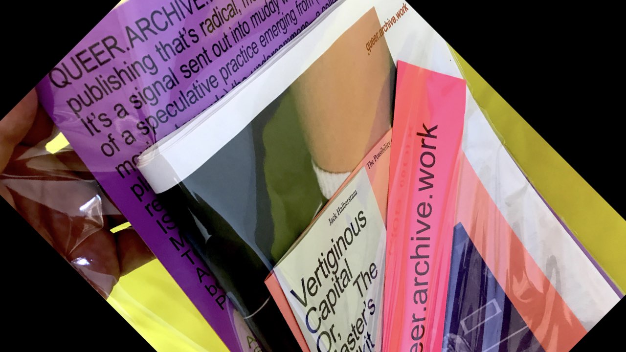
This collaborative publication is unlike anything I’ve done before—it was designed to make a mess, both in the bag as the components shift and change position, and when they slide out of their container. There’s no preferred narrative, just a collection of items that can be read in any order. Nothing in this publication is bound. No staples, glue, or tape. The nine parts use folding, nesting, and enveloping to bring the ideas together loosely, in a messy, legible way. Sheets can be pulled out and rearranged, re-ordered and re-written.
I think there’s a power in this loose assembling, gathering artists together into an urgent moment, and letting that moment be defined by the artists themselves. Letting the ideas seep out and mingle in a contact zone, in a mess of relations that’s probably meant to remain unresolved. I want to start working on a new version as soon as possible—let’s call it QUEER.ARCHIVE.WORK 1.1. I want to test my three demands more intentionally. The contributors for the next version will be selected by the artists from the first. This grows the network into a chain of relationships, letting us publish quickly and urgently, putting the work out there together, to speculate and imagine together. Somehow this feels like the most radical part, to collaborate and build something strong that resists a quick and easy read, something multi-faceted that shines and reflects all at once, occupying several positions at once, as if to say—let’s look together at the potential of this present moment, let’s gather a loose assemblage to enable a becoming.
Back to top