soulellis.com / writing / tdc2021
Paul Soulellis
I’ve been looking for queer typography. Is anyone else out there? Who else is searching? I wonder if this is even a valid question. Looking for queer anything often feels lonely. The word queer resists definition, sometimes aligned with ideas about rejection, refusal, deviating from the expected, away from the normative. It’s certainly a political word, one that’s taken on expansive qualities throughout its history, qualities that aren’t necessarily confined to gender and sexuality.
As early as 1993 Eve Kosofsky Sedgwick wrote: “A lot of the most exciting recent work around ‘queer’ spins the term outward along dimensions that can’t be subsumed under gender and sexuality at all: the ways that race, ethnicity, postcolonial nationality criss-cross with these and other identity-constituting, identity-fracturing discourses, for example. Intellectuals and artists of color whose sexual self-definition includes ‘queer’ . . . are using the leverage of ‘queer’ to do a new kind of justice to the fractal intricacies of language, skin, migration, and state.”
And so in this search for queer type (or queering type, or queerness in typography), I’m looking for a messy mix of criss-crossing connections and intersections. And that is the spirit of this talk, a kind of wandering and searching that may not result in clear answers, but could open up space for community and conversation. That’s why I’ve decided to pose this question here, at this particular conference. This talk is an inquiry and an invitation. Within it, you’ll find an understated request. A need to connect with kin, with like-minded folks searching for other histories, other approaches, other ways of doing design that don’t necessarily adhere to what’s expected or what’s considered successful or meaningful. Looking for ways to resist.
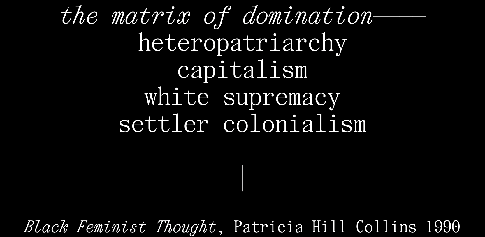
And yes we’ve heard a lot about resistance recently, but I’m talking about a much longer trajectory here, the stories of struggle and oppression and liberation that can be found wherever power is doing its thing. Heteropatriarchy, capitalism, white supremacy, and settler colonialism—this is the matrix of domination, as named by Patricia Hill Collins in Black Feminist Thought (1990). All of these forces are in full effect today, right here at this event, intersecting and impacting every one of us in art and design, in unequal ways. The matrix of domination produces particular burdens and privileges that determine who gets to succeed. As well as who doesn’t—who isn’t included, who isn’t collected in the archive, who is not written into history. Who is labeled as Other, who is dismissed as failure.
Failure is closely aligned with queerness in this way. For this idea, I’m using the work of queer theorist Jack Halberstam, borrowing from his book The Queer Art of Failure, where he asks us to look closely at what we can learn from failure in our archives, “the failures that we might build upon in order to counter the logics of success that have emerged from the triumphs of global capitalism.” Those logics of success are the specific ways that heteropatriarchy is maintained in capitalism, through acts of accumulation, reproduction of wealth, individualism, exceptionalism, control, and sovereignty. Values like these that are rewarded within the matrix of domination; values that perpetuate racial capitalism, and that we continue to teach in art and design schools. And that many of us uphold when we call ourselves designers and participate in disciplines that are sustained by, and depend upon, these same logics of success.
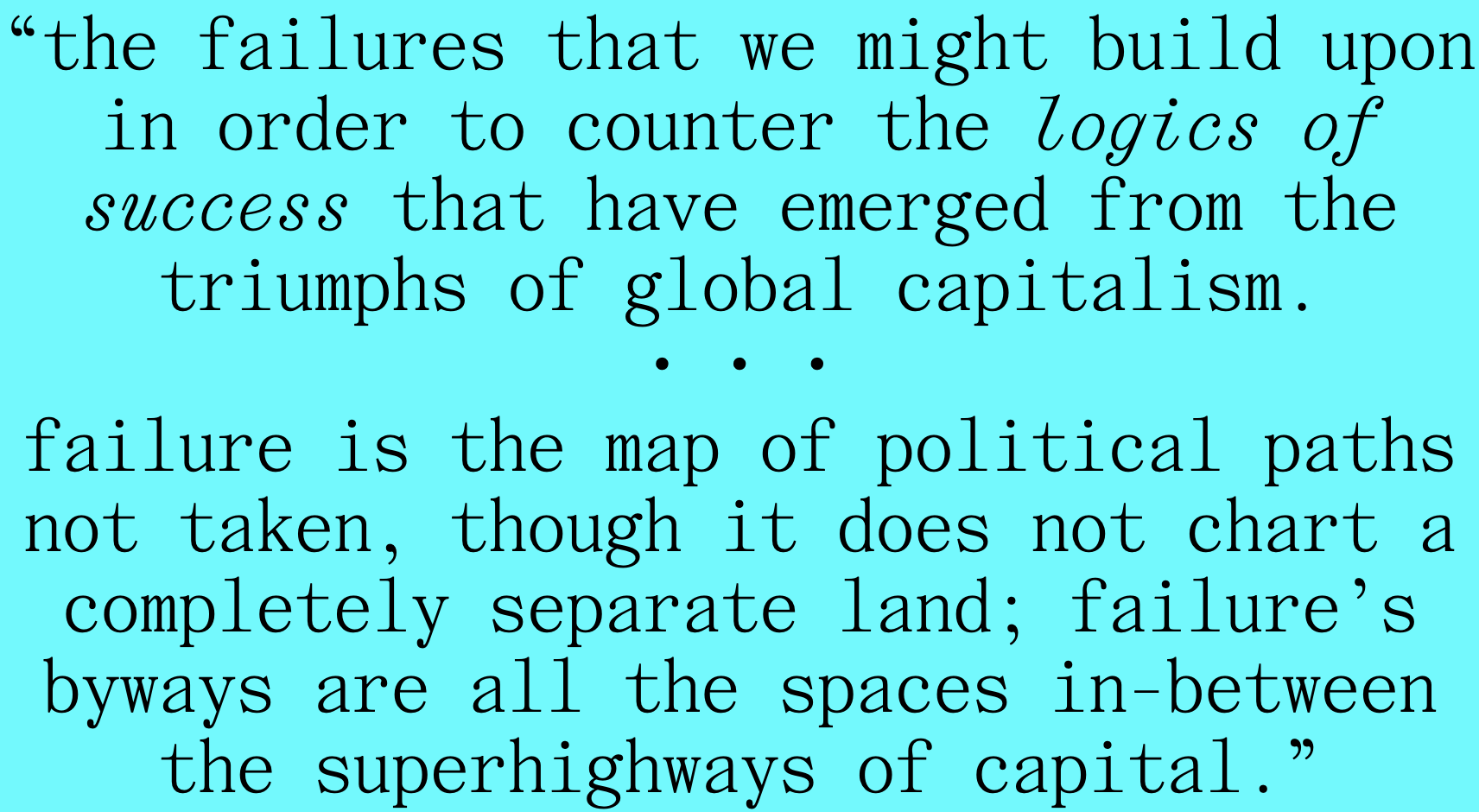
Halberstam goes on to write that: “failure is the map of political paths not taken, though it does not chart a completely separate land; failure’s byways are all the spaces in between the superhighways of capital.” Those in-between spaces that Jack wants us to consider can be found right here in the archive, where history is written and where the legacies of capital and power are shaped. In the archive’s in-between spaces we might learn from the incomplete stories of deviants, wild agitators, and trouble makers who didn’t survive. And the wayward queers, borrowing Saidiya Hartman’s work on waywardness. In those in-between spaces are those who were maybe not legible at all, along with those who were neglected or totally erased by capitalism’s relentless drive along logics of success. Those who don’t measure up within any territory that defines itself as a discipline or an industry.
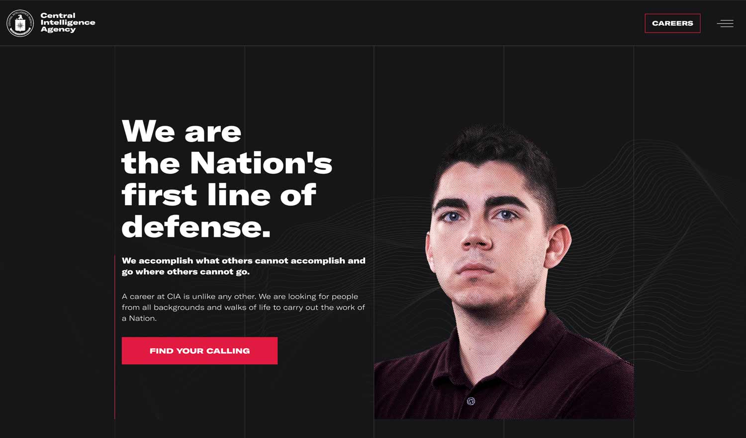
And so, that brings us back to type. In a recent talk by Dennis Grauel, he identifies some of the ways that the type design industry participates in these logics of success. Type design, and the business of making and selling fonts, is political. And intricately entangled with capital. He brings up the recent re-brand of the CIA, and how fonts frequently uphold and support imperial power.
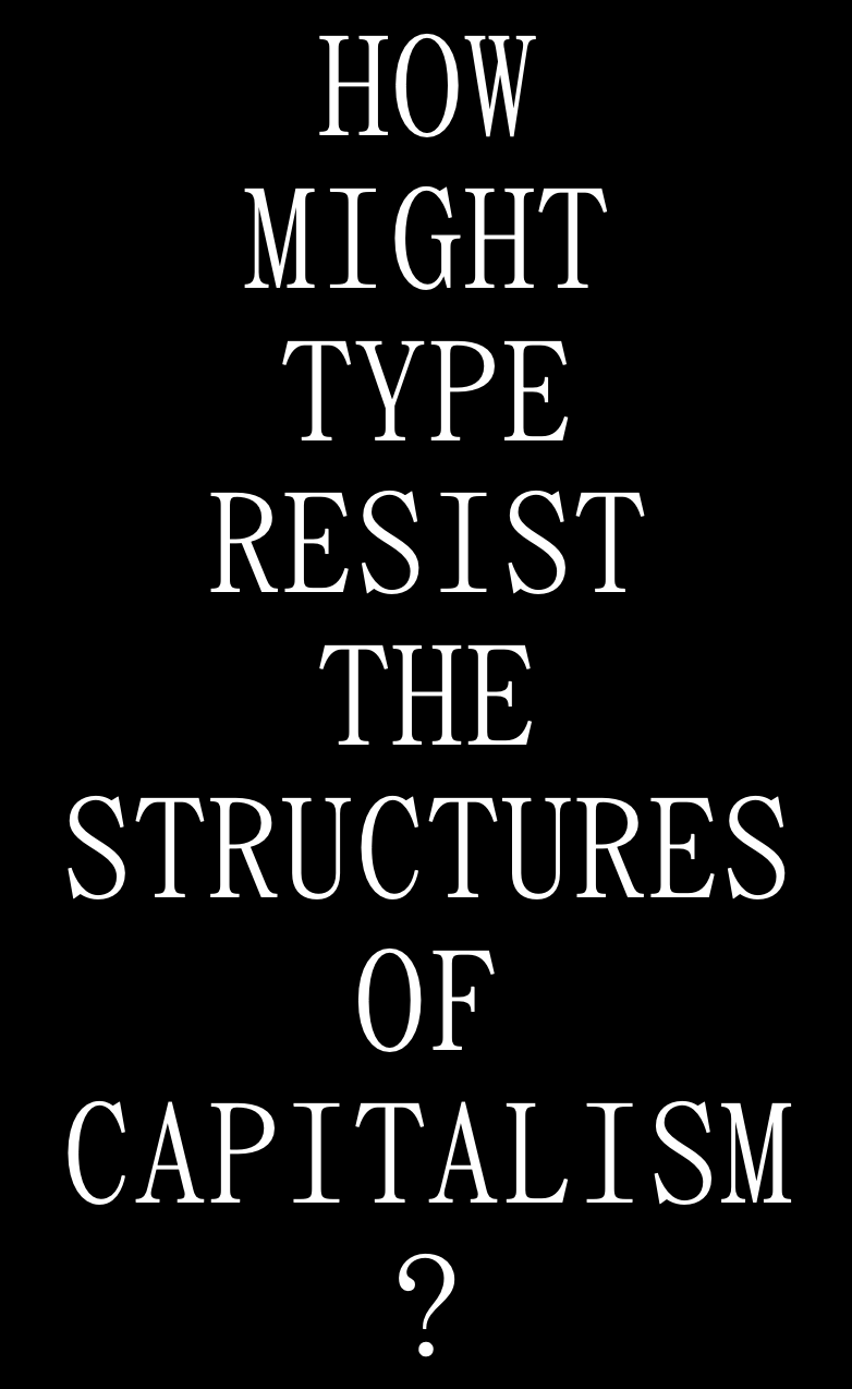
He asks: “when we excuse the foundry for selling a product to anyone with money, maybe we’re failing to imagine ways that fonts could resist the structures of capitalism.” Ok, so this is one place to begin, this failure of the imagination that Dennis mentions. Maybe we should approach “what is queer type” by starting with this more challenging question—how might type resist capitalism?
Dennis has a few suggestions. Like shifting value from a production-based paradigm to a maintenance one, using care as the framework for type design and distribution. Radical acts of care can be one of the most effective ways to resist capitalism, which so deeply needs to extract and to exploit without concern for others.
Dennis also brings up alternative pricing strategies and the idea of “messy” licensing. And a shift from the industry-based foundry to the community-based shared library. As well as open source and beta releasing, and how these models work to counter commodification, keeping type products fluid and changing, never really official, never totally complete.
These are excellent suggestions, but are they queer? I’m not sure. At the core of typography, as it’s been taught and practiced for centuries—is control, precision, preservation of standards, the idea of perfect legibility, and the myth of the lone type designer as genius author.
These dovetail almost perfectly with Jack’s logics of success. Not only are they aligned, but they are produced by and they help sustain heteronormative capitalism and the totalizing idea of universal design standards, dictated by the ideologies of modernism. So yes, I propose that anything that appears to push back against these ideas might take us to queer places, people, and practices. We’re getting warmer.
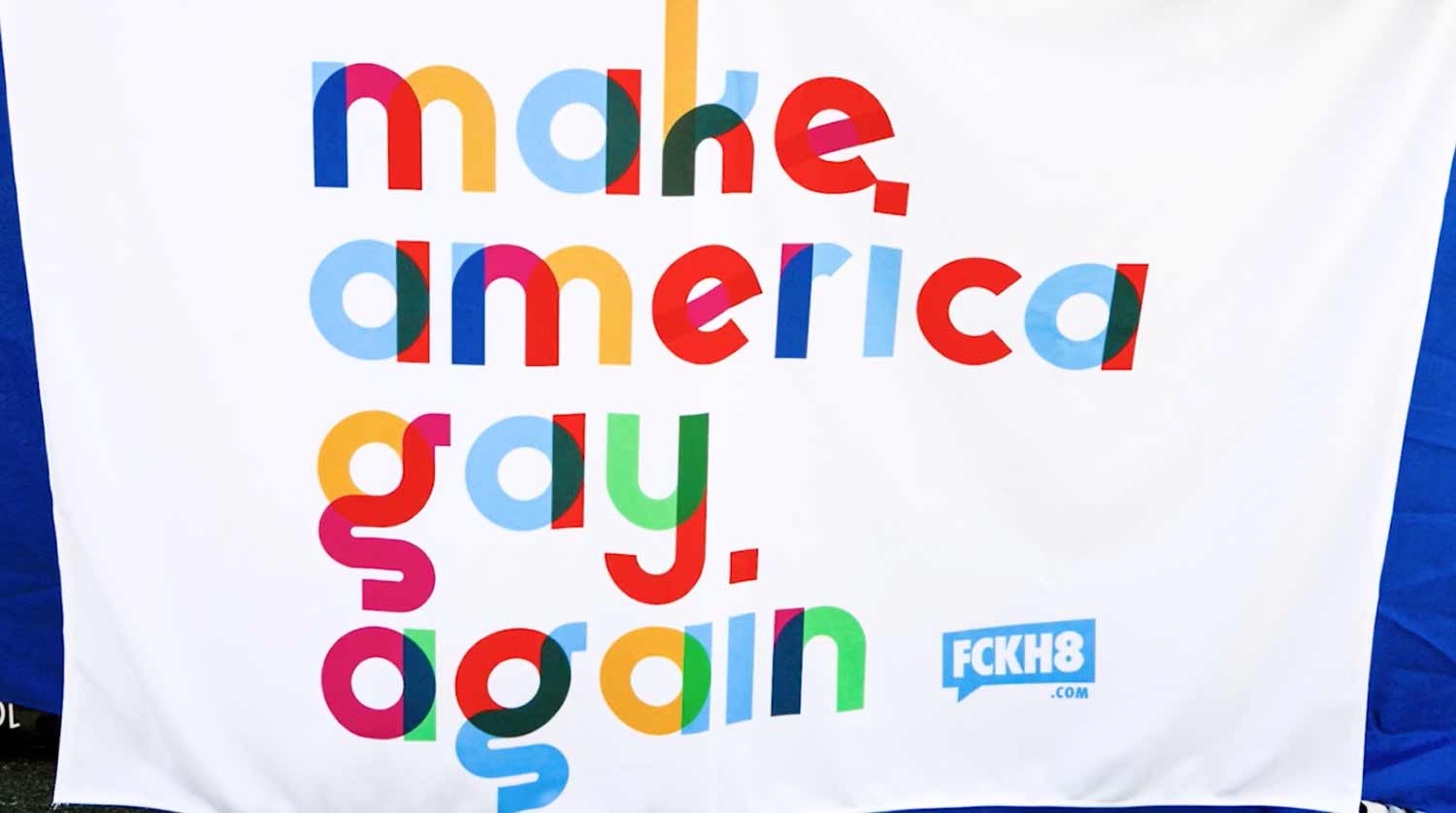
When I asked the question on twitter recently—what is queer type—the responses were all over the place, which I expected. Several folks replied with stylistic ideas, type that’s been dressed up to carry a rainbow, or adorned in a particular way. These may be important for other reasons, but it’s not style that I’m after here. Can something that reads as “corporate pride” ever be considered queer? I don’t think so. Queerness may be expansive, but one thing it’s not—is conformity within a corrupt system.
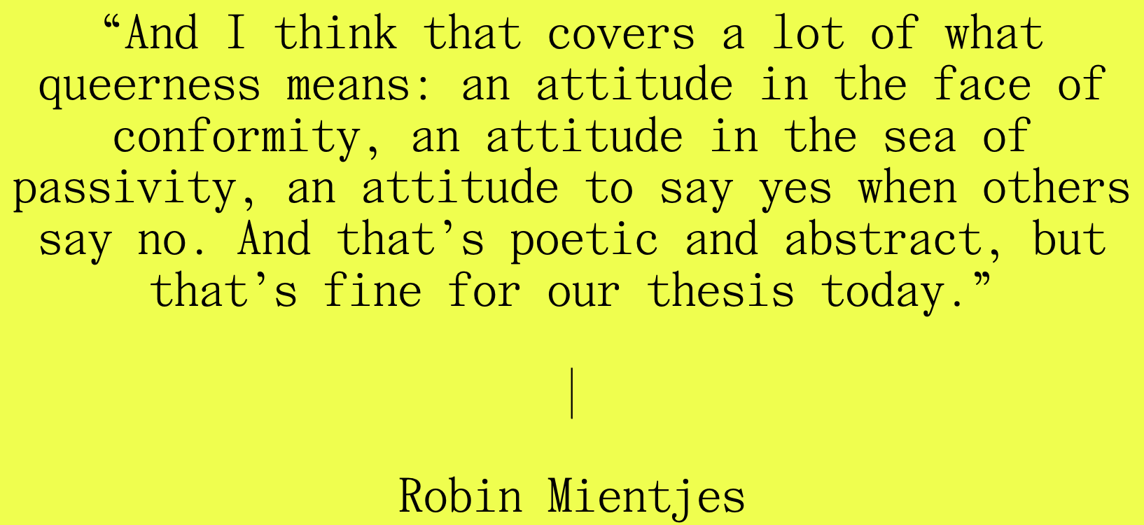
This was stated to me in another way by type designer Robin Mientjes, who said that when asked what they thought queer design was, replied: attitude. “And I think that covers a lot of what queerness means: an attitude in the face of conformity, an attitude in the sea of passivity, an attitude to say yes when others say no. And that’s poetic and abstract, but that’s fine for our thesis today.”
This was one of those beautiful moments of criss-crossing in the lonely search, and I was grateful to hear this from Robin, to know that queerness is difficult to define in formal terms, but that it might involve a stance, a particular position, an attitude. The last thing that I would want for a talk like this one is to fix these ideas into specific definitions in any way, so let’s keep it poetic, as Robin suggests, and continue, loosely.
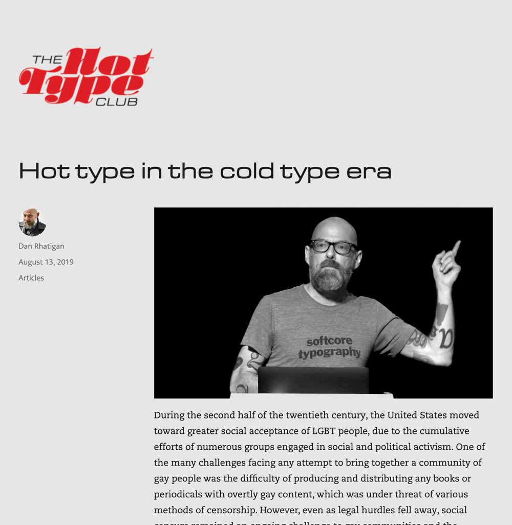
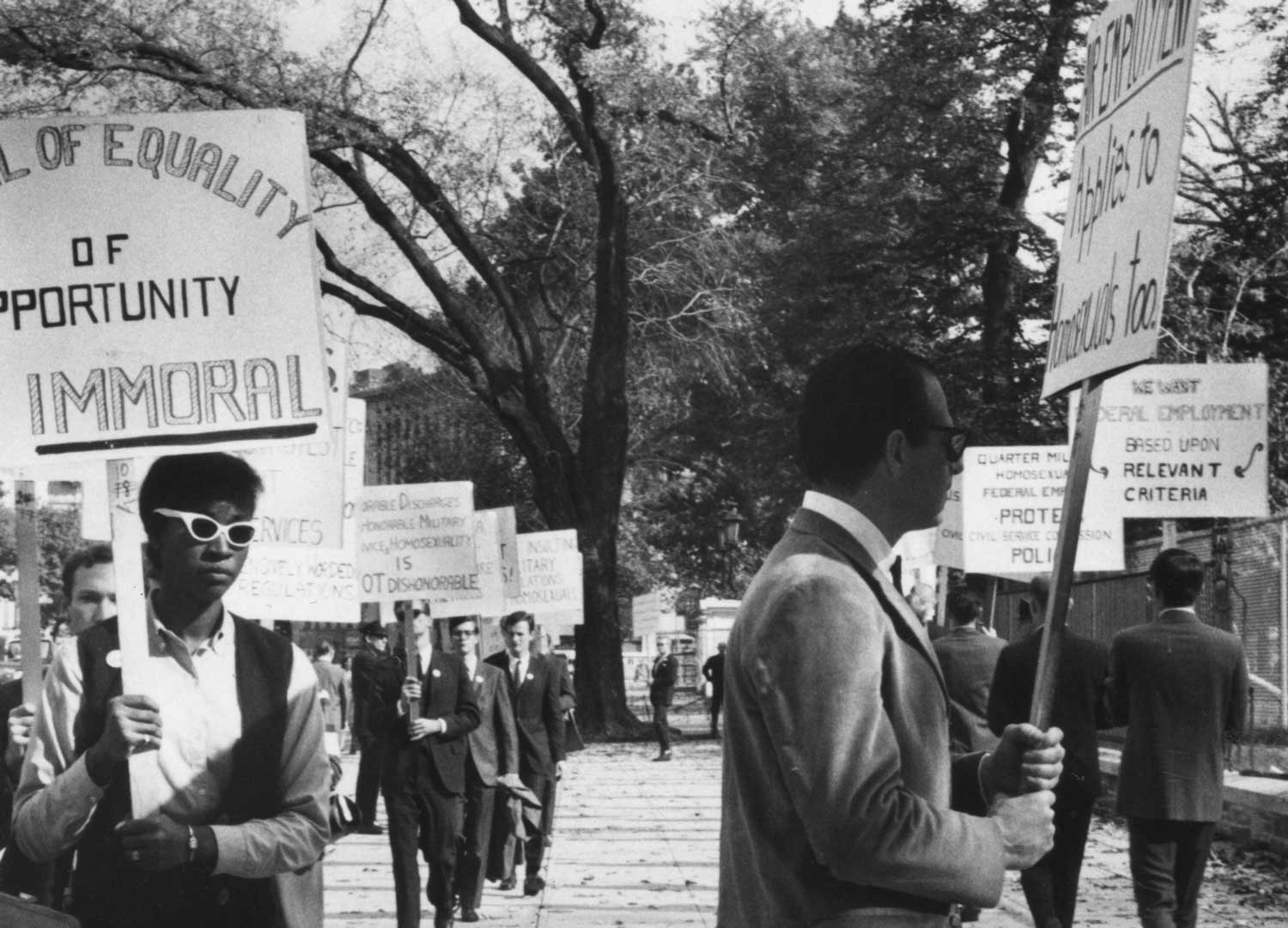
Dan Rhatigan also replied, with his extensive research into gay publishing in the 20th century, especially around adult magazines and the increasing number of gay photo publications that began circulating in the 1960s and 70s.
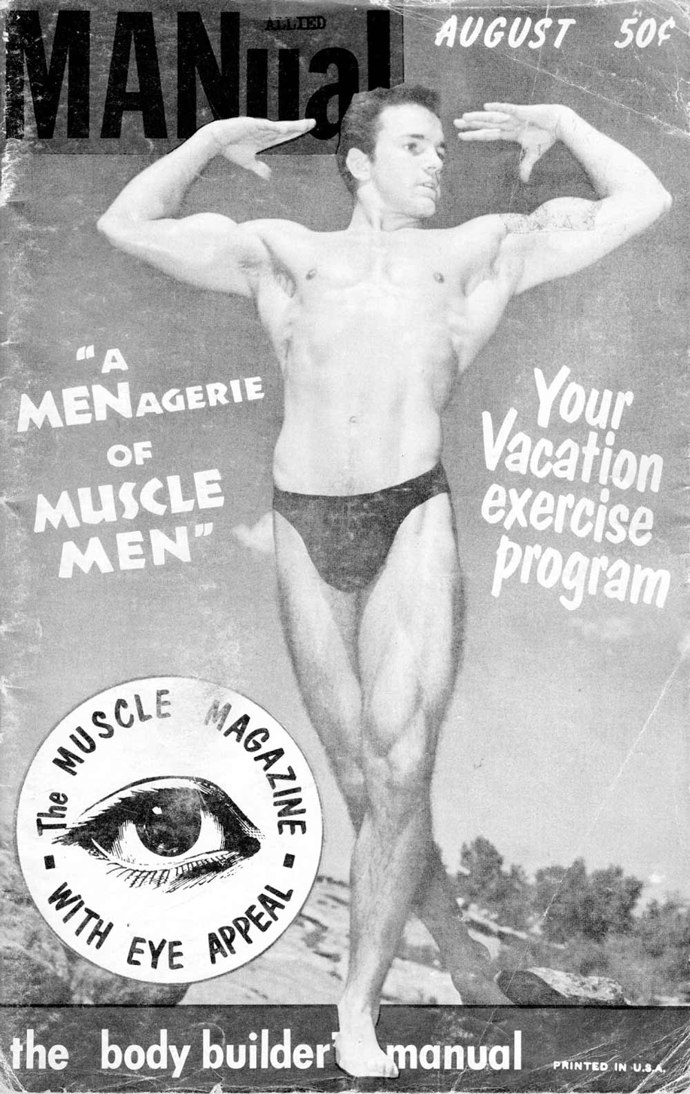
The ability to publish gay and lesbian content wasn’t exactly easy or mainstream at that moment, but it was becoming more and more possible,
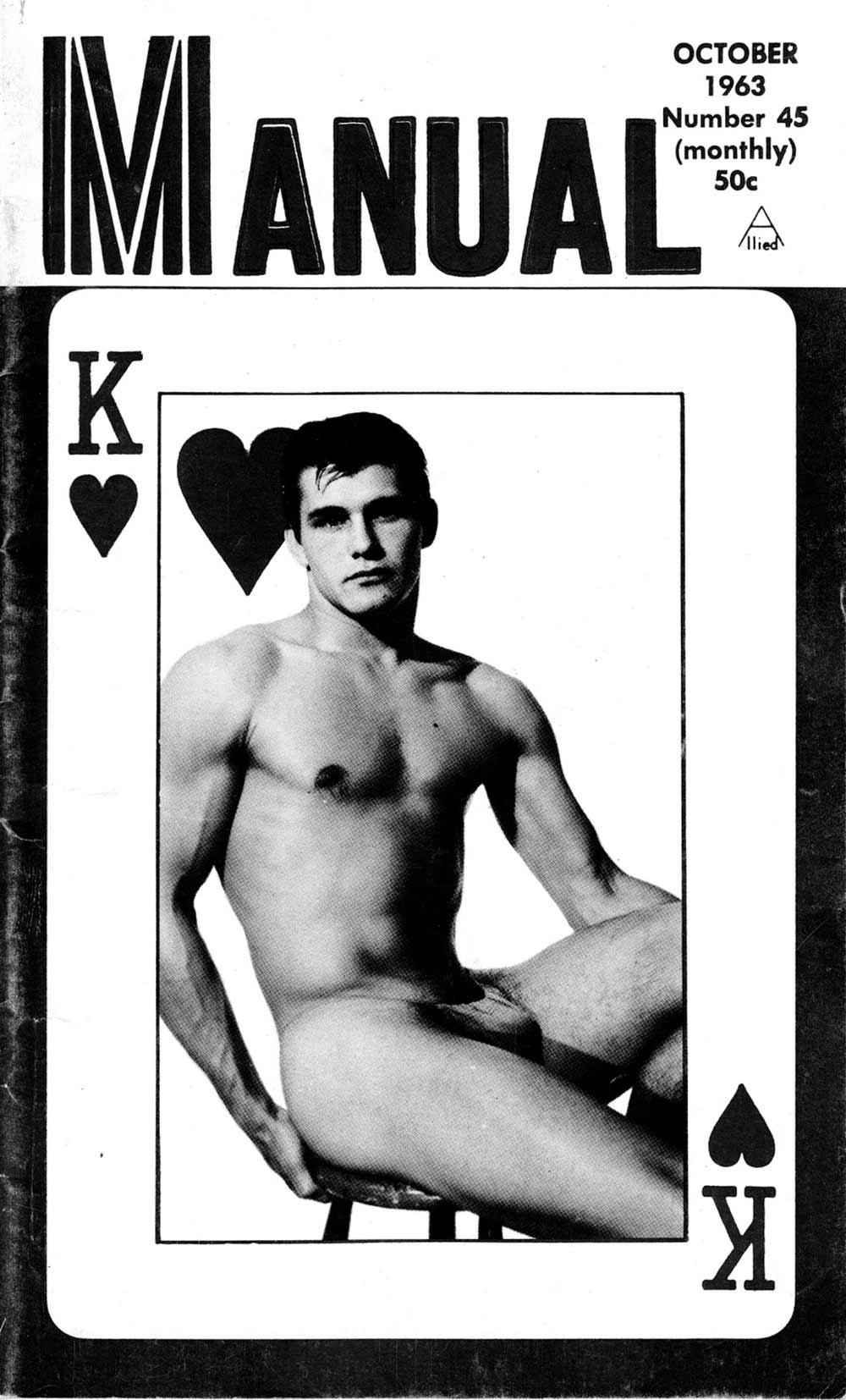
and so for the first time ever we see typographic decision-making happening specifically in relation to a gay male audience.
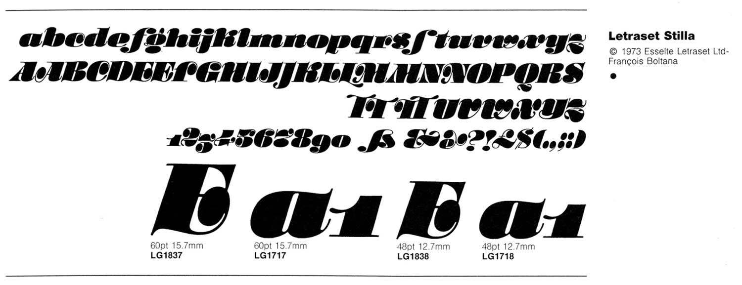
Dan focuses on the Letraset rub-down letters that were used in the cover designs for many of these publications,
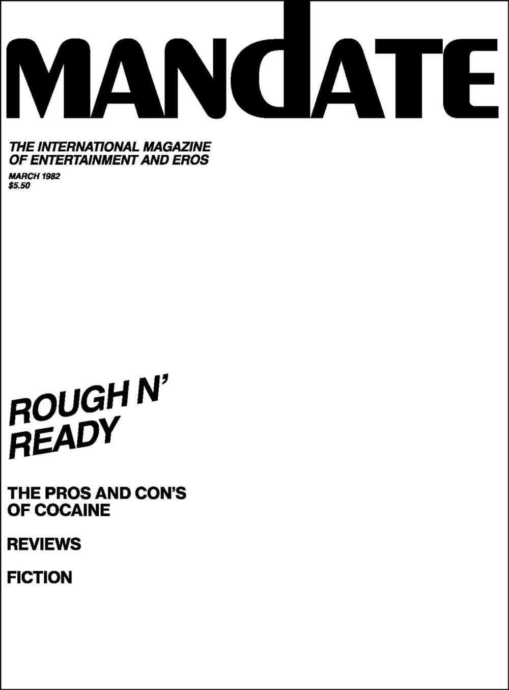
and shares his own project where he re-traces those covers as a way to isolate and examine the type, and reclaim history.
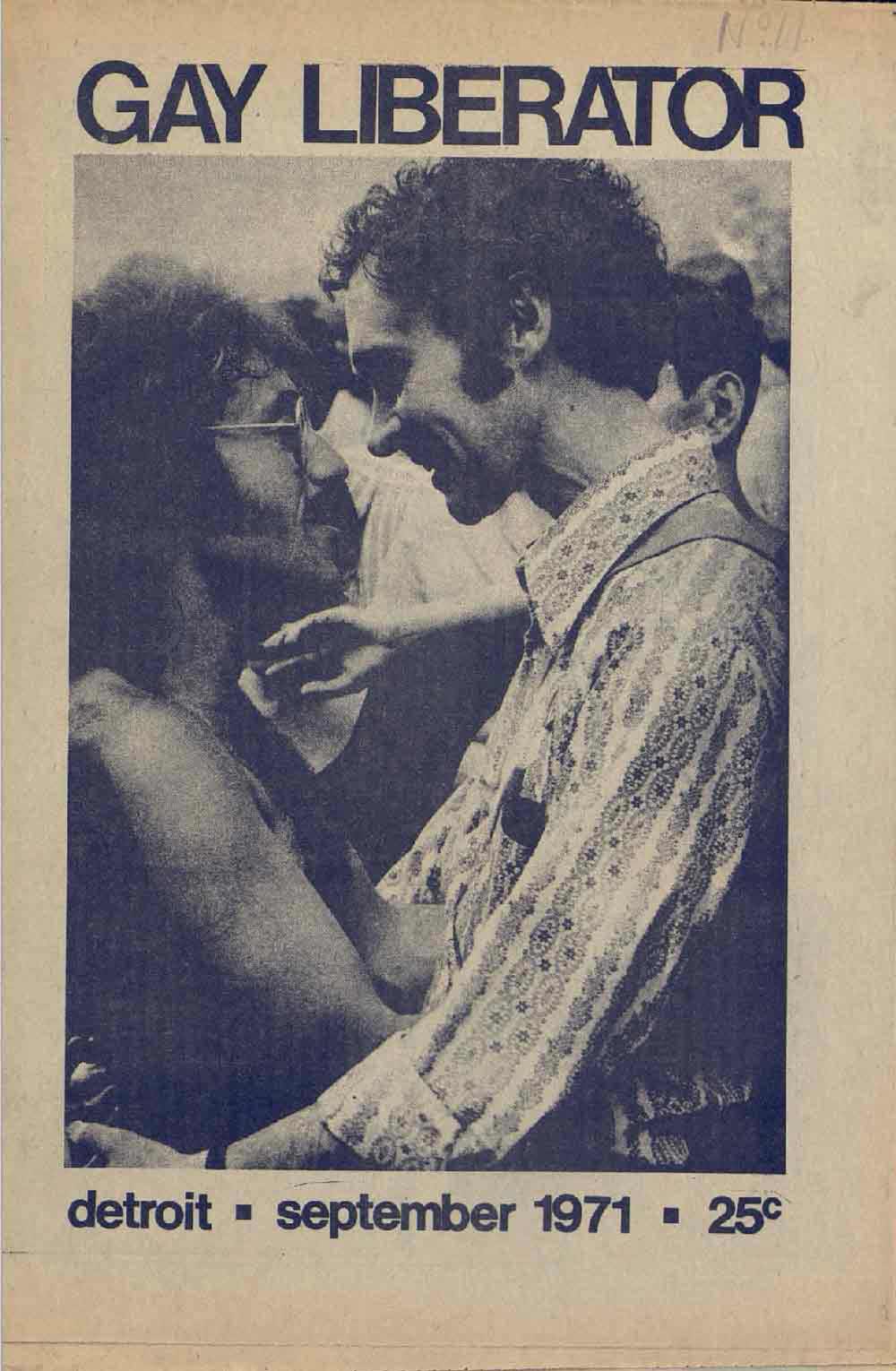
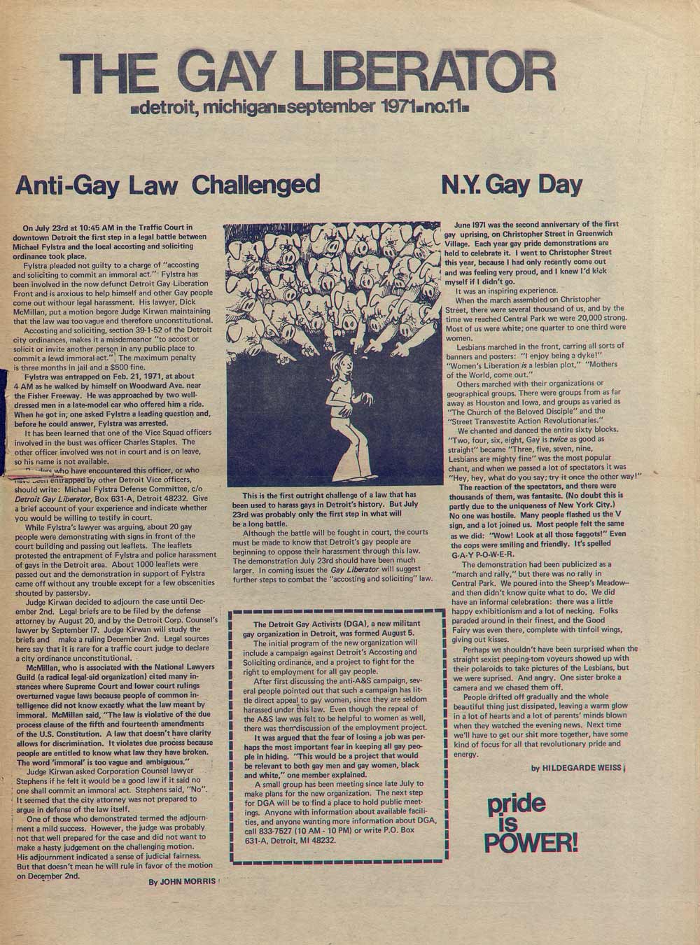
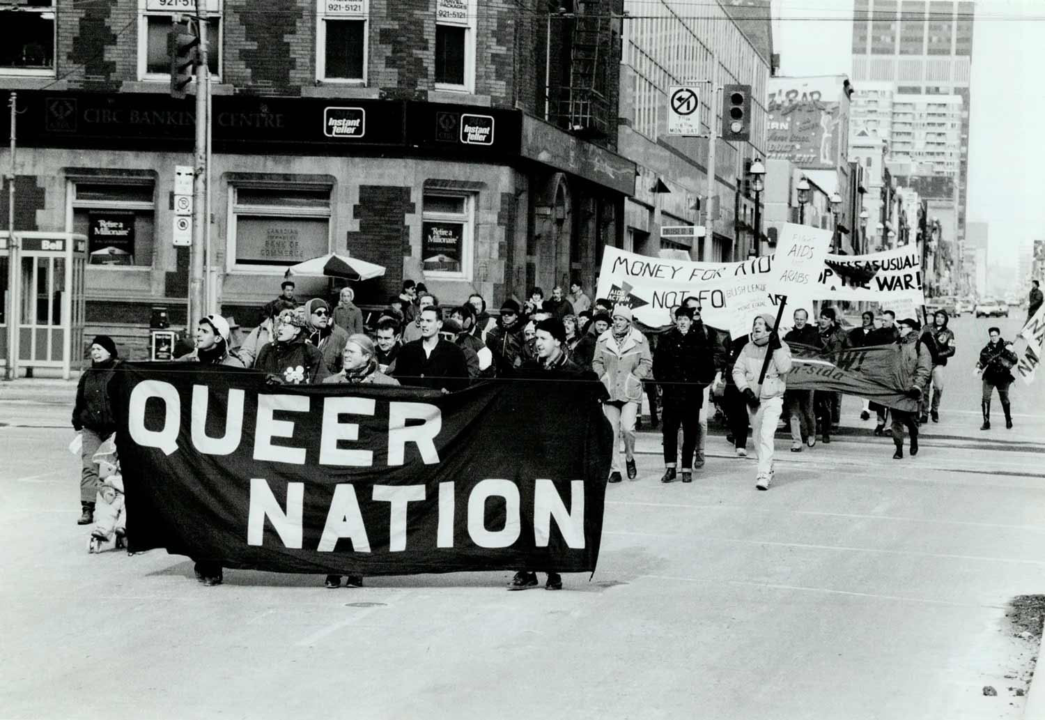
I’ve also been deeply interested in publication design from around that same time, the turbulence of the civil rights era, leading up to the AIDS crisis in the 80s and 90s. My focus has been on gay and lesbian liberation. And when I use language like that rather than more inclusive terms like queer or LGBTQIA+ it’s to acknowledge context, and how language operates in such limited ways; and the fact that this language sometimes reflects the limits and inequities of the movements themselves.
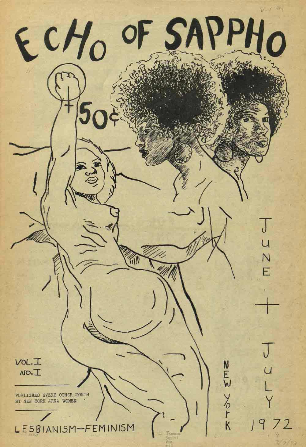
These are the newsletters and zines that documented what was happening, pre-internet, in those collective struggles towards liberation. This was how an underground network designed information, stayed in touch, and maintained care.
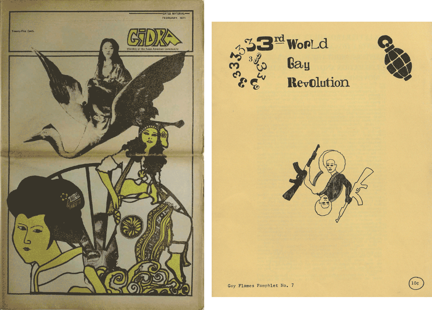
These radical publications were all very different from each other but there is a kind of approach and some fairly consistent design and typographic methods that are in direct contrast to the slickness and corporate control of mainstream graphic design of the time.
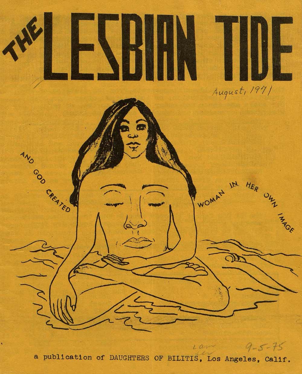
There’s the predominant use of do-it-yourself techniques that worked well with xerox machines and mimeograph printers, where duplicates could be made directly from an original master, like the risograph many of us love today.
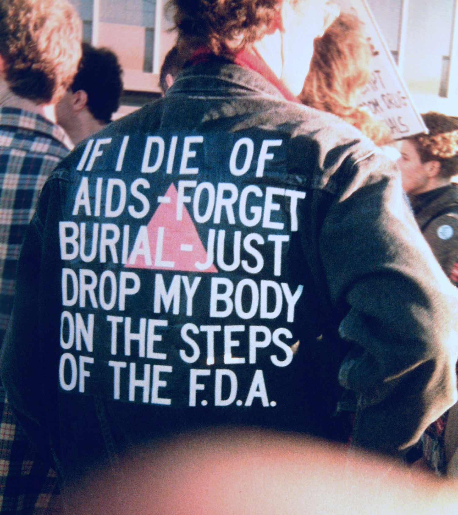
“IF I DIE OF AIDS - FORGET BURIAL - JUST DROP MY BODY ON THE STEPS OF THE F.D.A.,” jacket worn by David Wojnarowicz (September 14, 1954–July 22, 1992), ACT UP demonstration, Food and Drug Administration, Washington, D.C., October 11, 1988. Photo by Bill Dobbs.
As well as non-traditional acts of publishing as protest, using language and the body in public space, challenging what we even mean by publishing.
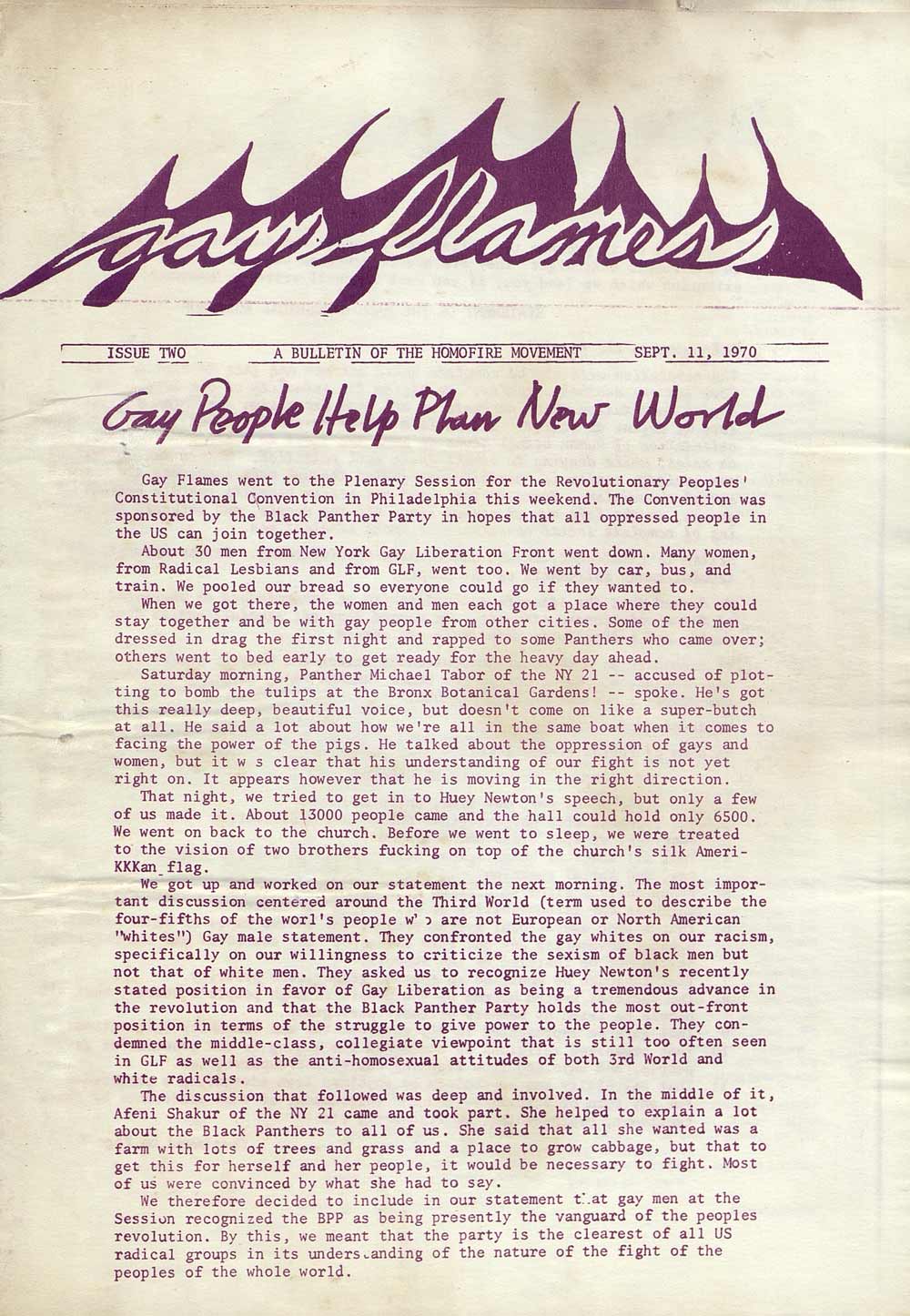
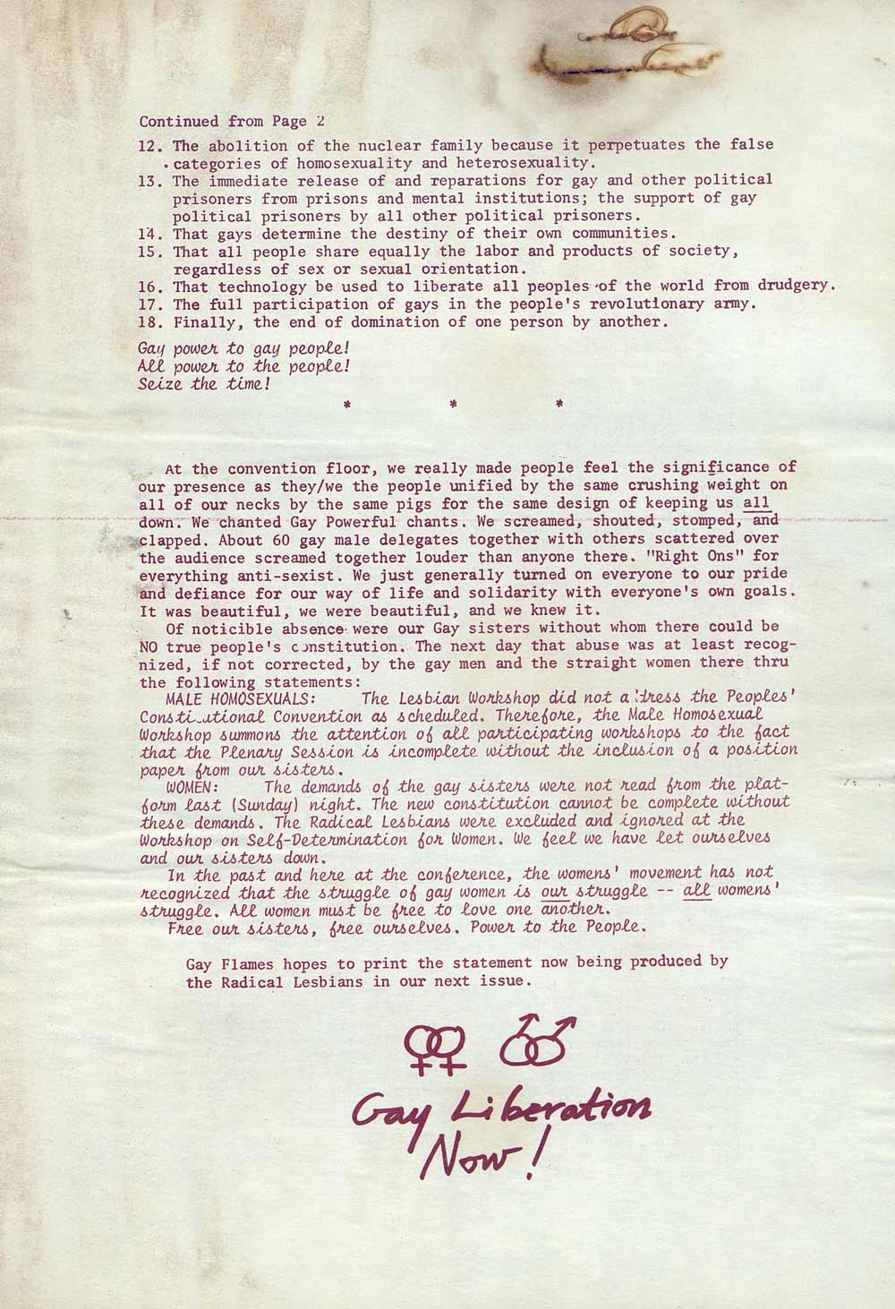
Radical artists, punk musicians, poets, political activists, and other fringe communities and movements could only publish because of access to cheap printing. Their newsletters and zines are full of inspiring examples of hand lettering, illustration, collage, and typed—rather than professionally typeset—pages.
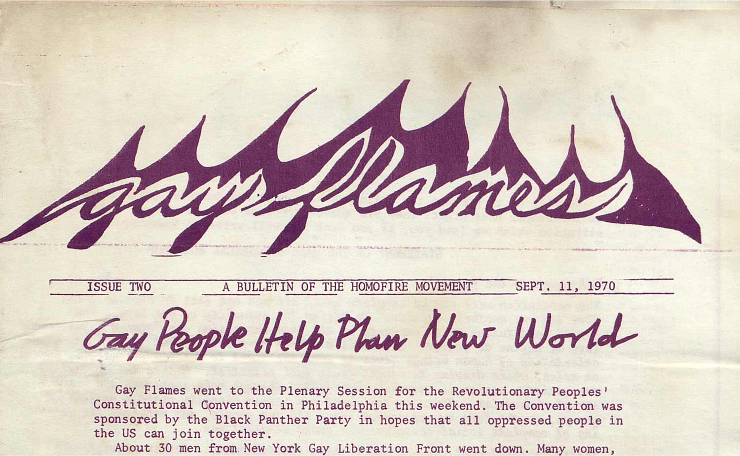
Looking back from more than 50 years in the future, I really hesitate to identify these designs themselves as queer. This is not a queer aesthetic, and it would be misguided for me to arrive at that conclusion.
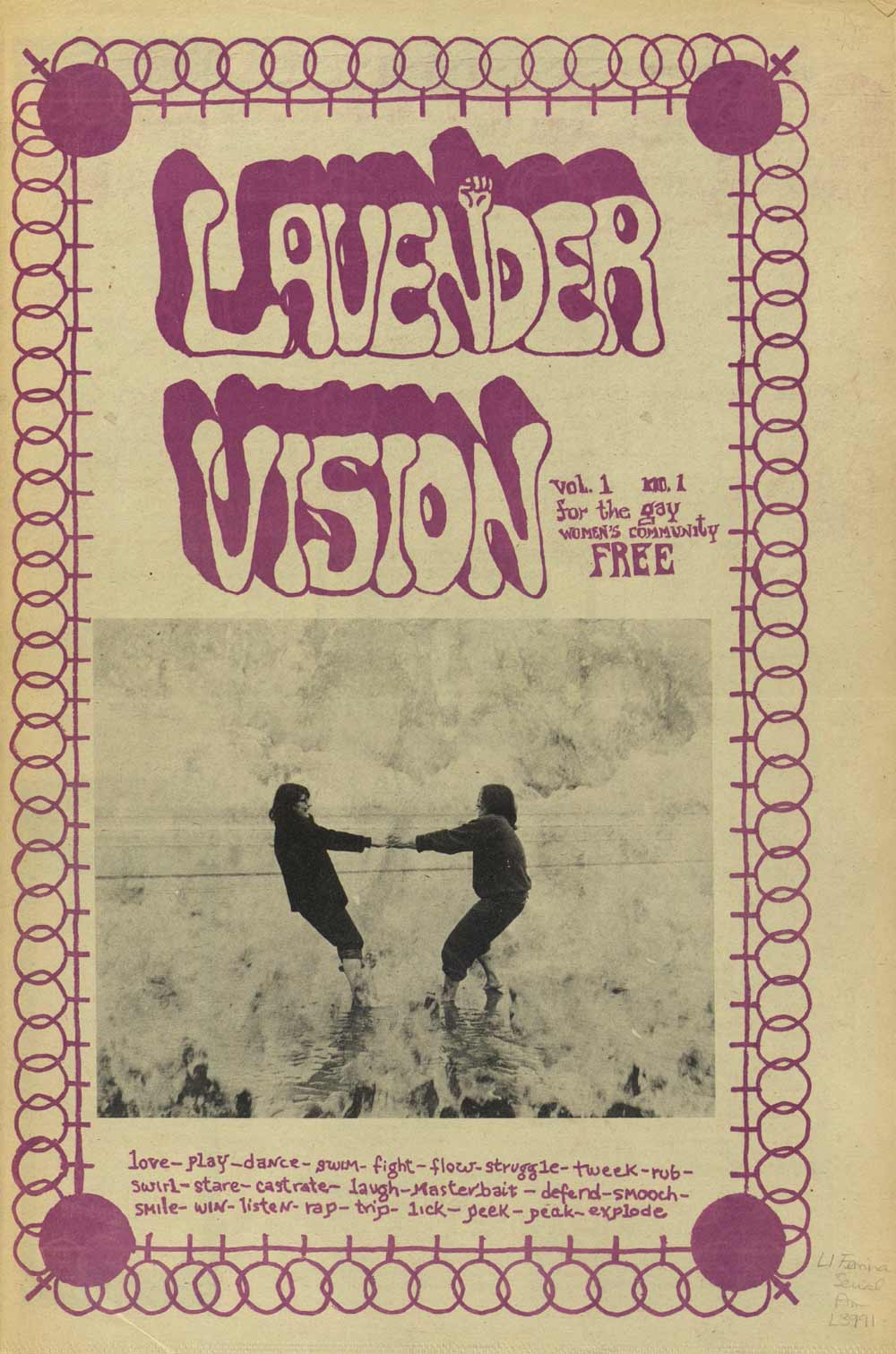
Many movements towards liberation, like feminism, racial justice, labor, and anti-war, used similar tactics. But still, there is something queer going on here, in the moves and the acts and the attitude—design decisions that were made out of necessity, outside of the dominant forces of the design industry and mainstream publishing, without access to sophisticated tools, or editorial design expertise.
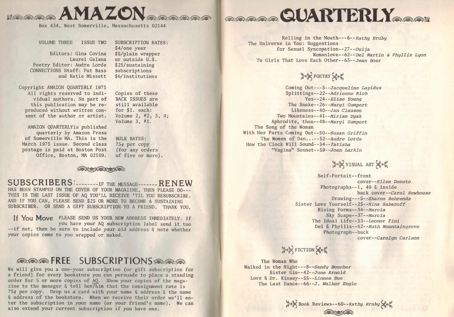
In this very broad sense, queerness can be located in the radical, outsider status of these publications and their designs. This is queerness as an underground, alternative way of creating networks of care. Queerness in the scrappy, ad hoc, and sometimes homemade designs that were directly related to the urgency of protest and activism and survival.
For Black and Brown communities who were trying to survive during the AIDS pandemic later on in the 80s, there was a need to work urgently with these available tools, and to do so freely, away from regulated spaces like the discipline of graphic design, as it was being defined in the academic and corporate worlds.
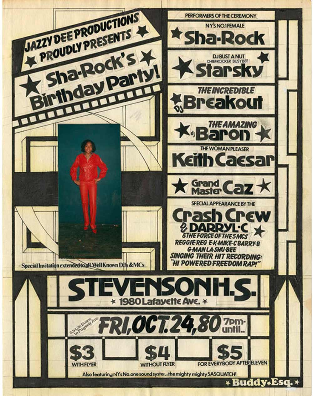
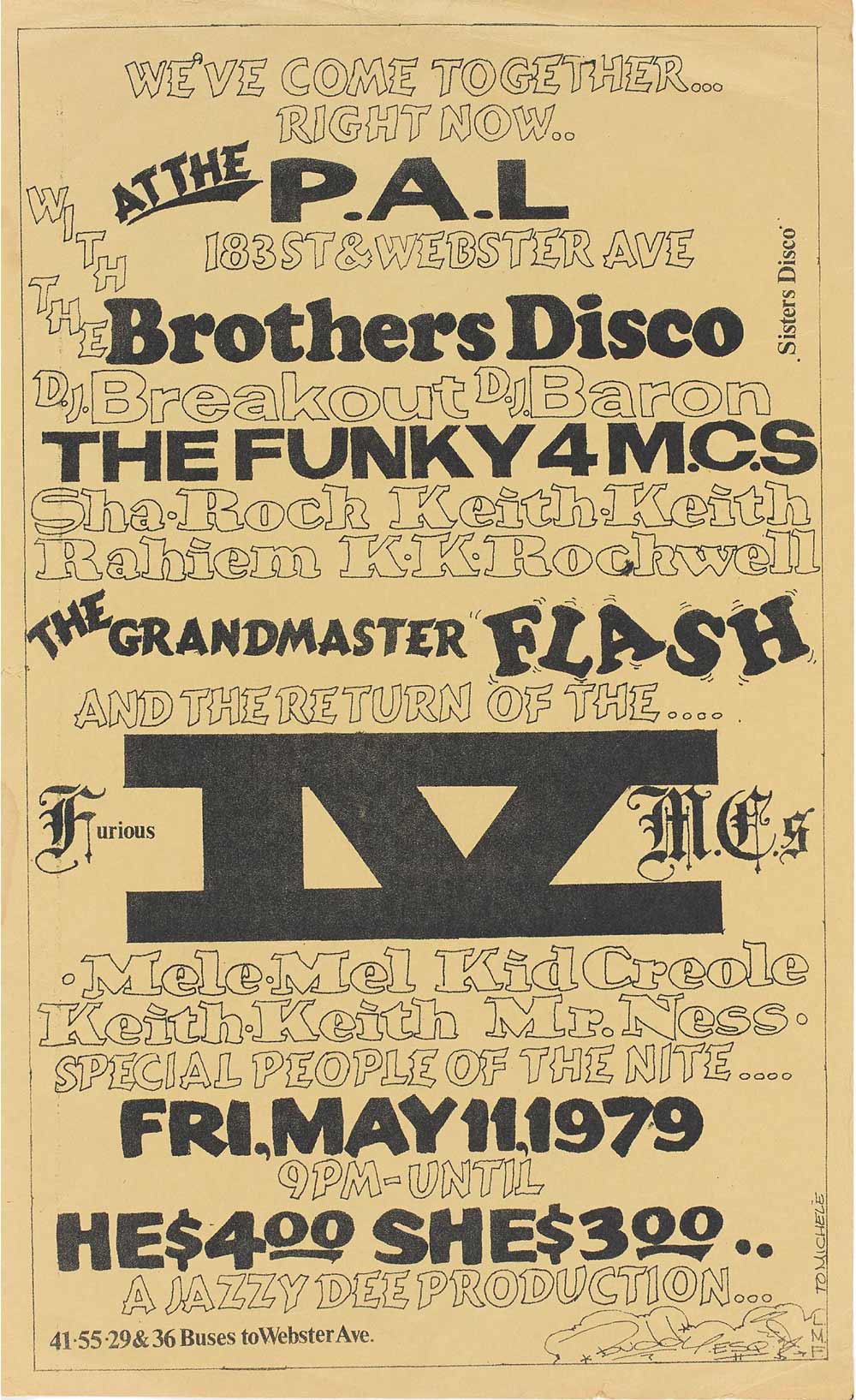
These club flyers for disco and hip-hop events in the late 70s and early 80s are extraordinary. Many of them were made by Buddie Esquire, a Black, self-taught graphic designer who was speaking to and on behalf of counterpublics that were outside of mainstream power.
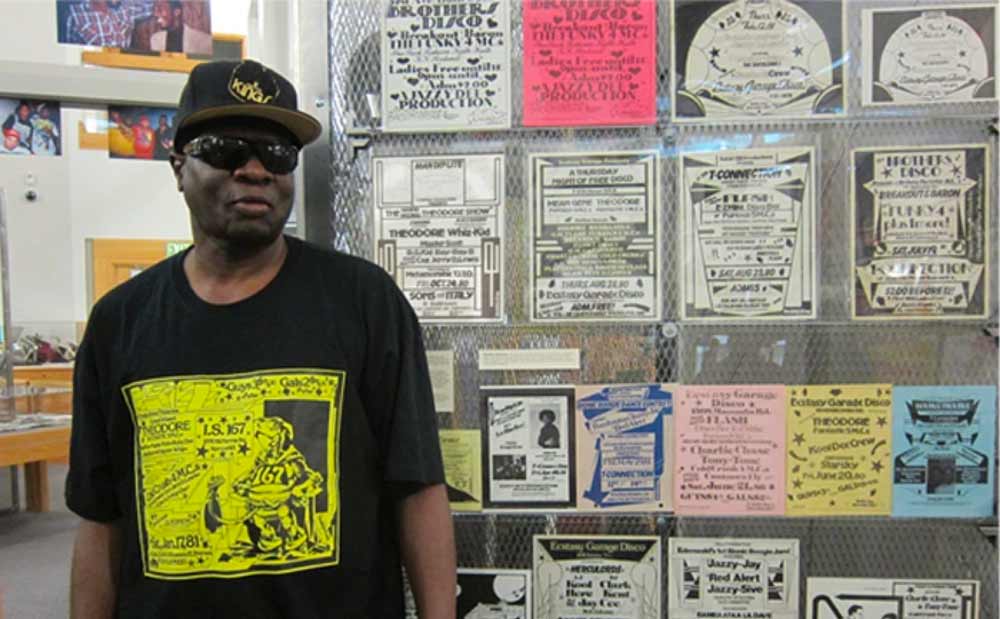
He used rub-down type, hand lettering and illustration to create a polyphonic voice that was legible only to some. Not necessarily a queer audience, but a community illegible to the gaze of white supremacy.
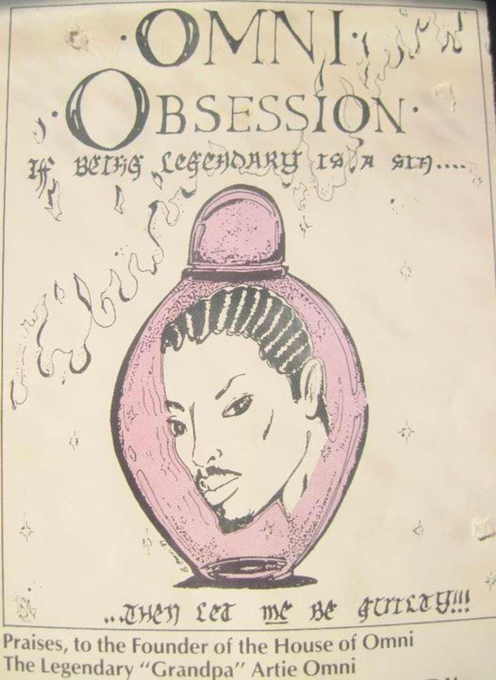
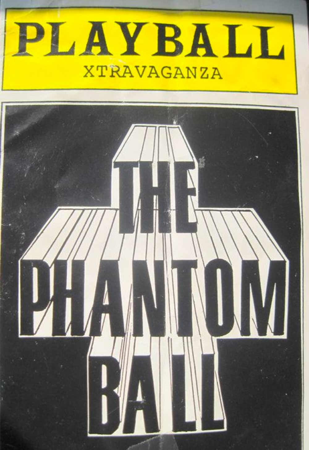
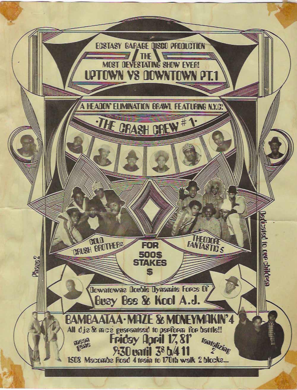
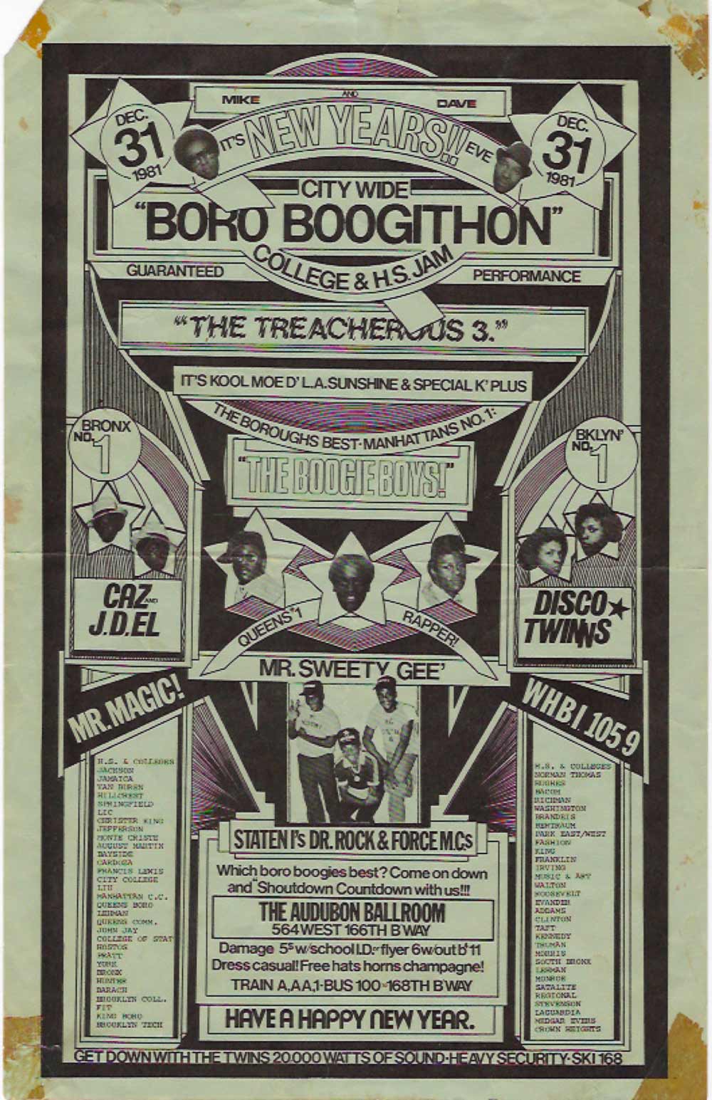
At the same time, here are flyers coming out of POC trans culture and Harlem’s Black and Latino ballroom culture in NYC and elsewhere, 30+ years ago. They suggest narratives of desire and escape,
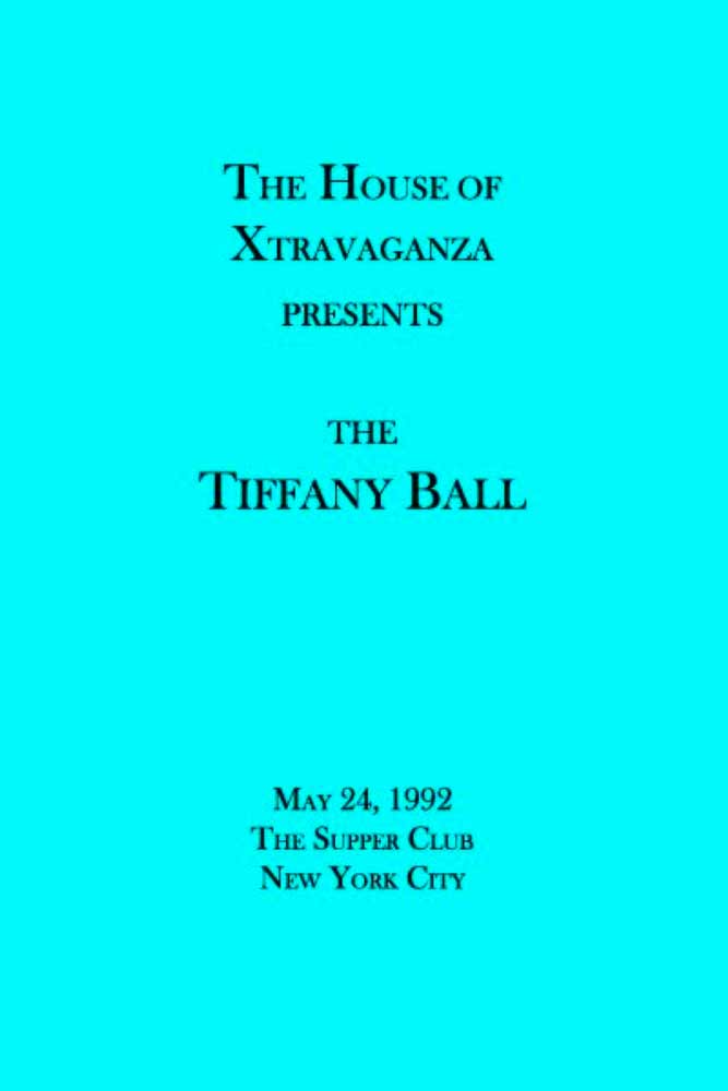
playing freely with pop culture and familiar symbols of consumer power, like an ad for Tiffanys or a Broadway Playbill, or an Obsession perfume bottle, but shaped on their own terms.
In the 90s, desktop publishing began to shift the tactics and technologies that were available, and with it came a new freedom to mix type styles to express plurality and a diversity of ideas.
I know we tend to think about zine culture in more recent terms, but radical queer and trans publishing was so important in the 90s, connecting communities outside of traditional spaces of power, just before the internet and social media really transformed everything.
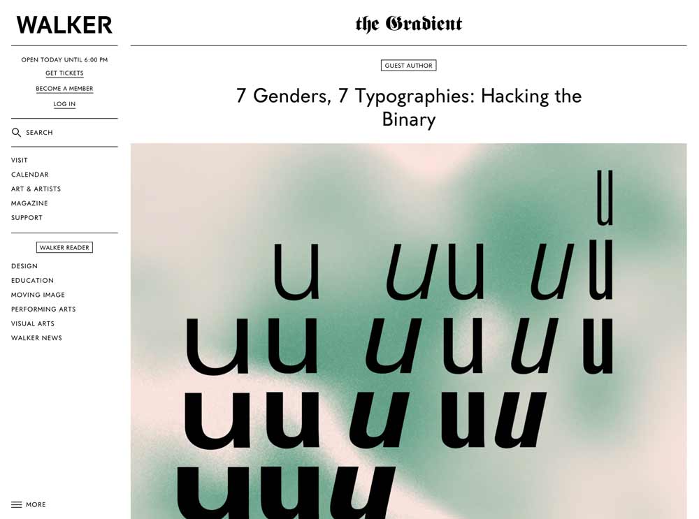
In “7 Genders, 7 Typographies: Hacking the Binary,” published online by the Walker in 2016, seven graphic designers were brought together to speculate about typography, using gender metaphors, according to gender categories that they defined.
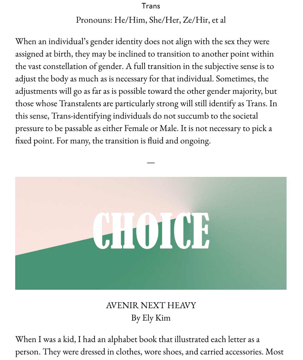
Female, male, intersex, trans, personal, non-conforming, and eunich. I don’t think it’s useful to categorize typography this way, to examine or classify type according to gender, or the other way around—this isn’t valuable in today’s discussion about queerness. Gender is not a metaphor. In an attempt to open up an understanding of how we think about either typography or gender, the use of metaphor here shuts things down and fixes them into place.
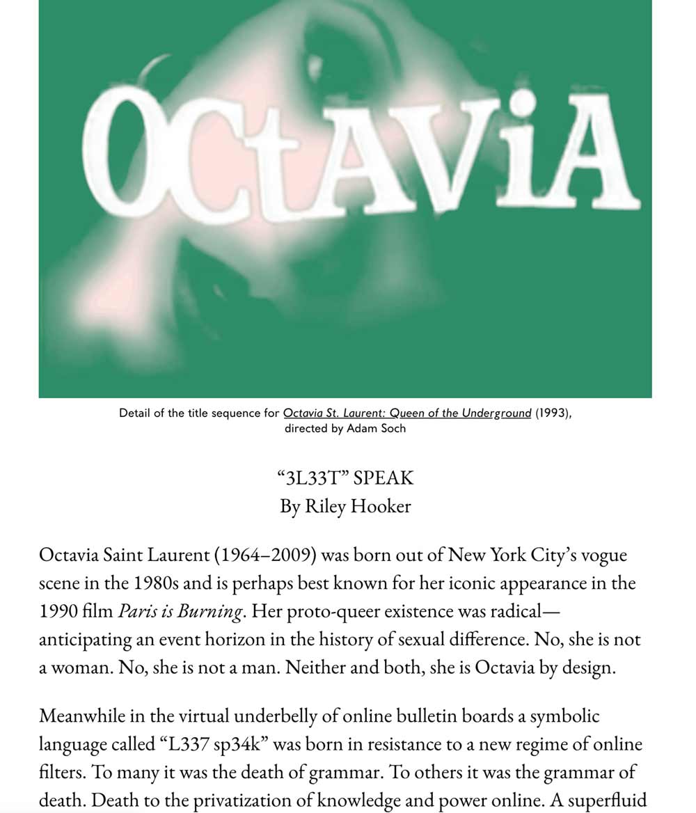
That’s okay though, we’re on another trail. But I do want to bring up one of the references from this project. It’s an important, striking piece of type that appears in the 1993 film Queen of the Underground. The subject of the film was Octavia St. Laurent, a performer and AIDS educator who identified at different times in life as Intersex and Trans. She was active in New York City’s Black and Latino drag society throughout the 80s and 90s, and passed away in 2009.
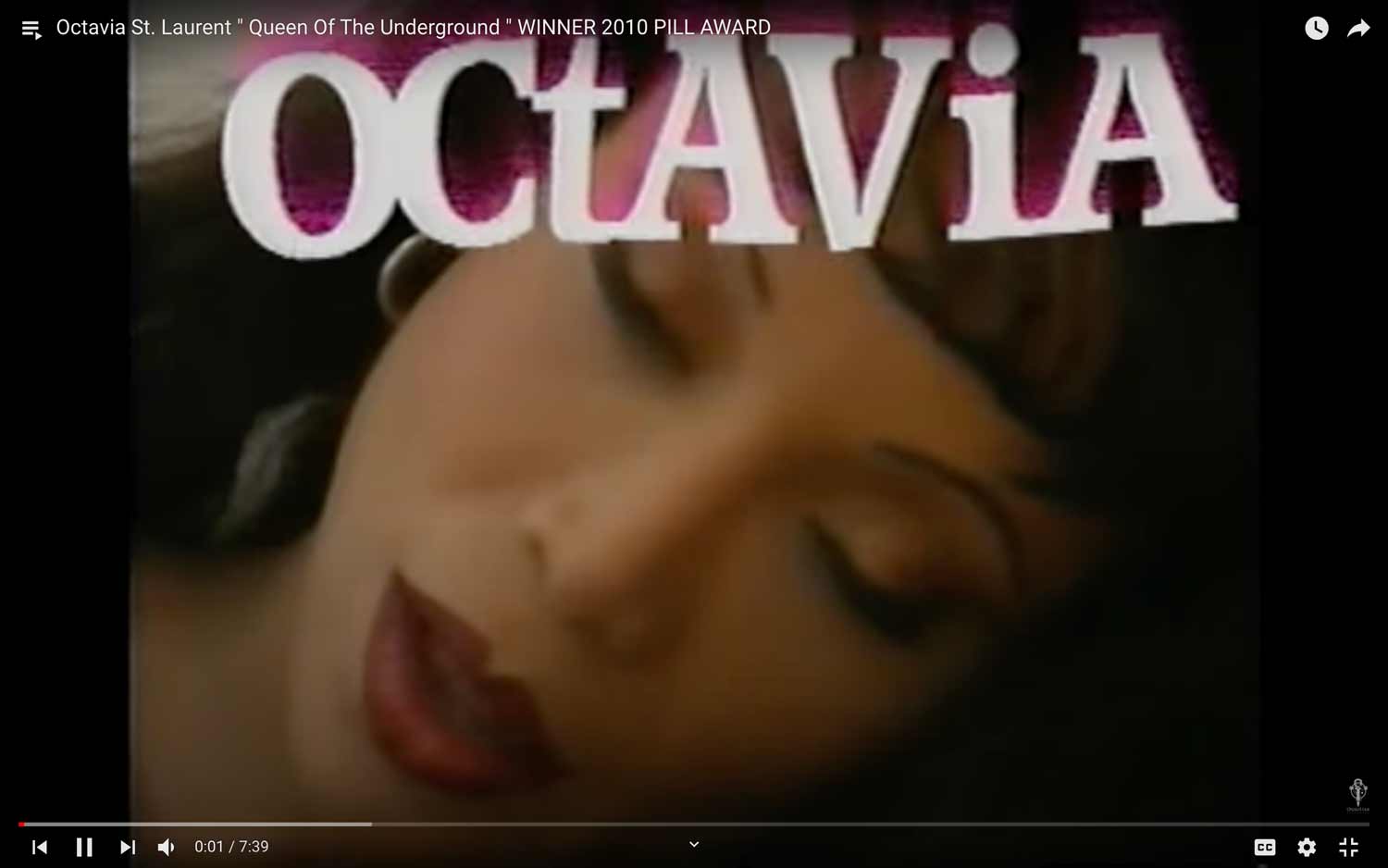
Her name is the first thing we see as the film opens, identifying her as the title subject as it enters at the top of the screen. Her name is set in a mix of both upper and lowercase letters.
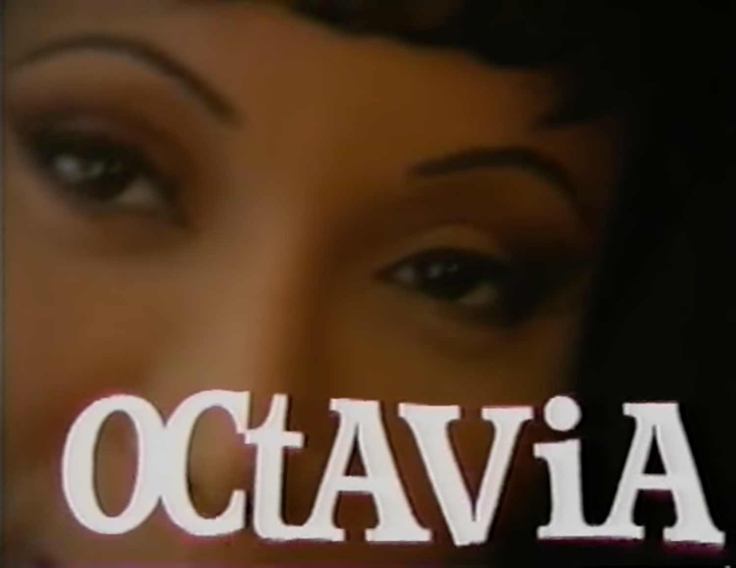
It floats down over her face, animating gently, waving hello, before settling at the bottom of the screen. The entire sequence only lasts 15 seconds. Designer Riley Hooker, writing for the Walker, refers to Octavia’s modified case setting as bearing a trace of “leet,”

also known as eleet or leetspeak, sometimes written like this: 1337 5p34k. Leet was an early internet way to modify spelling, originating on bulletin board systems in the 1980s; it was a pre-emoji way to encode or even obscure language with additional meaning through the act of typing.
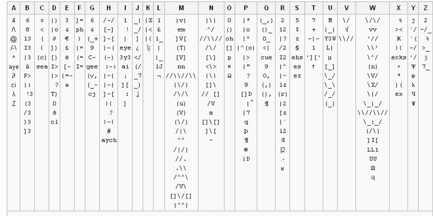
Riley writes that it brought “a new logic into the typographic vernacular.” Leet can be seen as a kind of argot, a secret language used by sub-groups to prevent outsiders from understanding what’s being said, like for example, typing out the word “hacker” in stealth mode, like this: h4x0r.
Queerness has a close relationship to secret languages, like the hanky code, also known as flagging, which was popular in the 70s and 80s. Or Polari, a slang language spoken in 19th century gay England, which was in use until recently. I think there’s a crucial connection to be made here, between queerness and legibility. And what it means to use language—how it sounds, how it looks, how it writes—as a way to control legibility and meaning.
When we teach typography the focus is on control. But we learn to master these rules as though they’re universal, as though there exists an optimized way to read.
Perfect typography means predicting an idealized reading experience. And a very particular power dynamic, involving knowledge, manipulation and control.
This is the mythology of the genius type designer and typographer, who know, with proper education and expertise, how to shape language and manipulate meaning. How to create precisely engineered typographic systems that enable perfect legibility on pages, walls, and screens.
Who are the unseen powers controlling the read in these environments? Who do they speak for?
What kind of idealized audience has been imagined in their design? How do we, as designers, participate in these logics of success?
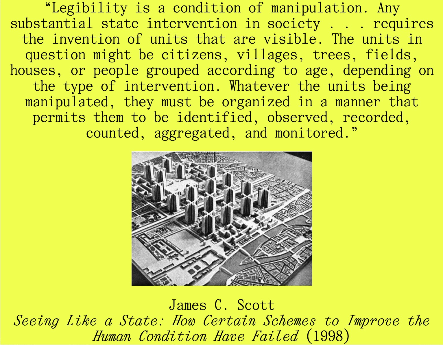
Here, it’s important to think about legibility in a political sense. Political scientist James C. Scott writes that “Legibility is a condition of manipulation. Any substantial state intervention in society . . . requires the invention of units that are visible. The units in question might be citizens, villages, trees, fields, houses, or people grouped according to age, depending on the type of intervention. Whatever the units being manipulated, they must be organized in a manner that permits them to be identified, observed, recorded, counted, aggregated, and monitored.”
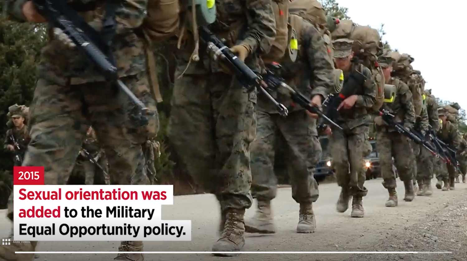
And so for decades, we’ve seen how the fight for visibility—the fight to be seen by the state, to become clearly read units—invariably leads to status and success shaped not on our own terms, but by heteropatriarchy, like marriage equality, inclusion in the military, and the ability to accumulate and reproduce wealth.
Participation in these logics of success demands legibility. The clear reading and gridded organizing of bodies and identities that leads to prediction; predictive models that lead to policing; and modes of surveillance that accelerate and engage with every aspect of our lives.
When this legibility is problematized, or complicated in non-normative or non-conforming ways, these actions are read as threats. And depending on who you are, especially if you fall outside of the idealized subject—that is, if you’re not white, cis gendered, and able bodied—those acts and identities are severely punishable.
In a recent conversation with Nat Pyper, an alphabet artist who designs fonts, and nicole killian, an artist and educator who sets their name in all lower-case, we talked about this question “what is queer type.” And at one point Nat said a remarkable thing that shifted the entire conversation:
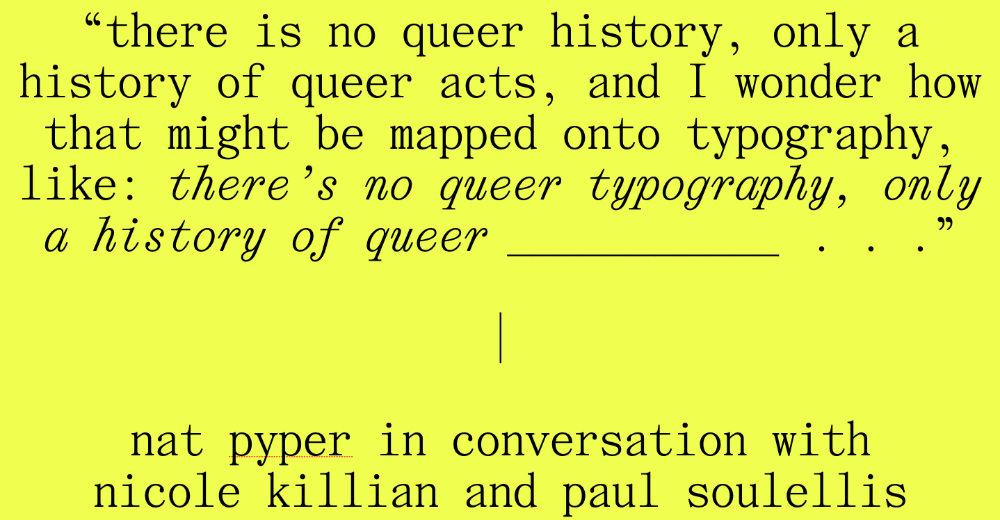
“there is no queer history, only a history of queer acts, and I wonder how that might be mapped onto typography, like: there’s no queer typography, only a history of queer _____” . . . and after a few seconds it was so obvious to us—queer reading. And queer writing.
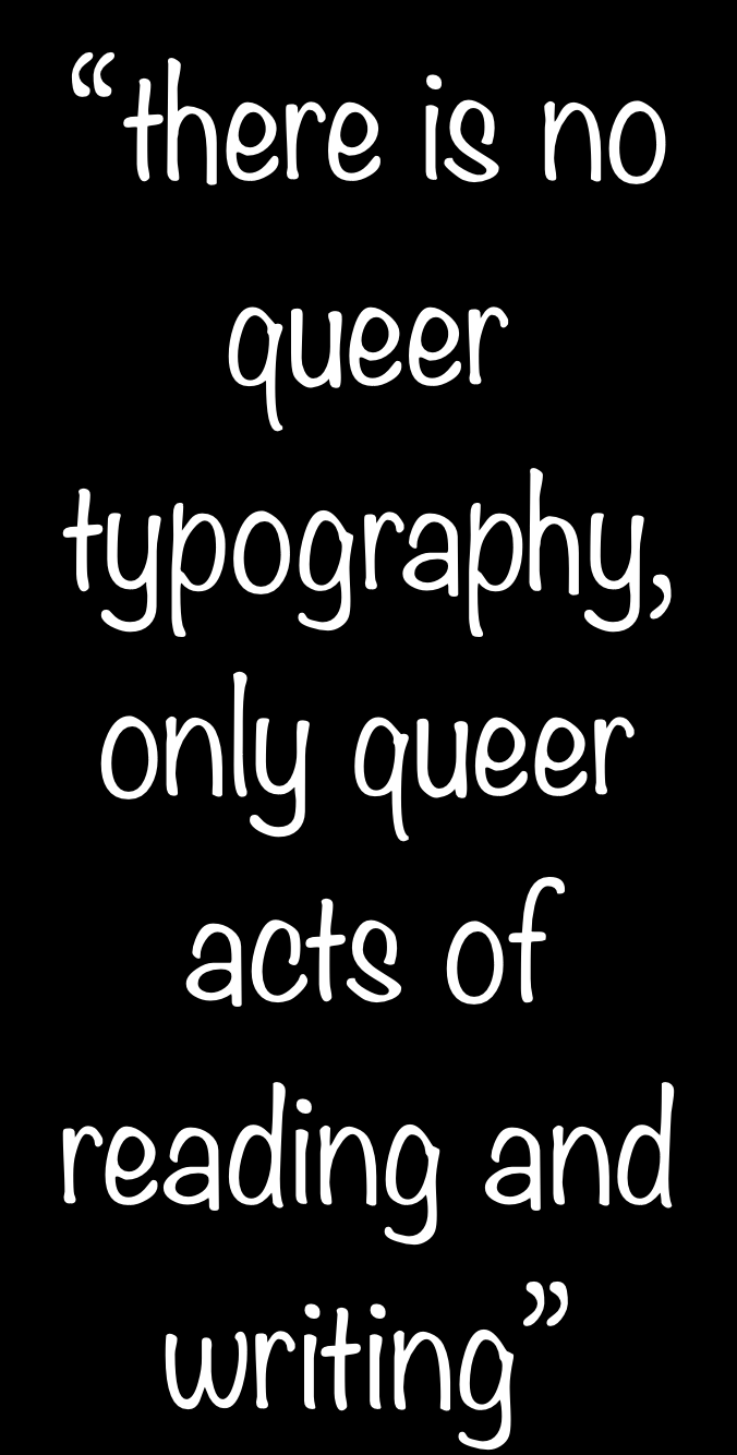
There is no queer typography, only queer acts of reading and writing. It feels new to say this now, but this is a statement that owes so much to more than three decades of queer theory and gender studies that brought us, among other things, the understanding that “gender is an act one does, rather than a thing one is” (Johanna Burton, “Irreconcilable Difference,” in Trigger: Gender As a Tool and a Weapon, New Museum, 2017).

And so, my original question, what is queer type, has been complicated. Let’s rephrase it like this: what is queer typing?

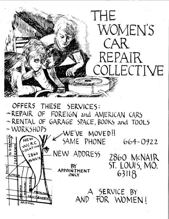
One of Nat’s recent projects is titled A Queer Year of Love Letters. It’s a collection of 5 free fonts. The fonts are named after queer artists, publishers, and activists who were particularly inspiring in their non-conforming practices and lives. This one (above) refers to the Women’s Car Repair Collective in St. Louis, Missouri in the 1970s,

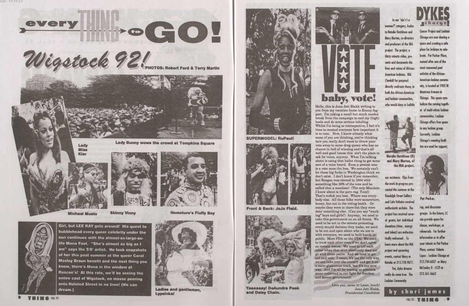
Above is Robert Ford, publisher and designer of the Black gay and lesbian underground magazine THING from 1989 through 1993,

Martin Wong (above), the gay Chinese-American painter who died of AIDS in 1999 . . .

G.B. Jones (above), the Canadian artist, filmmaker, and musician who published the queer punk zine JDs in the 80s, with Bruce LaBruce . . .

And Ernestine Eckstein (above), the activist who was the only Black lesbian at an early gay rights protest in front of the White House in 1965.
Here are Nat’s words, introducing the project, which come in the form of a love letter:
Dear writer,
A Queer Year of Love Letters is a series of fonts that remembers the lives and work of countercultural queers of the past several decades. The series aims to make the act of remembering these overlooked and illegitimate histories accessible to other people, as easy as typing. Better yet: it aims to make the act of typing an act of remembering. That these fonts might be considered typefaces is incidental. They are an attempt to improvise a clandestine lineage, an aspatial and atemporal kind of queer kinship, through the act of writing.
I began making these fonts in order to rapidly document and disseminate the work and ideas that they cite. I pack these histories, or part of them, into fonts for a couple of reasons. First, font files are durable. OpenType fonts (.OTFs) have persisted in their ubiquity since the late 90s and maintain their utility as a nimble and reliable format. Second, fonts have the capacity to contain a hefty amount of information within a tiny package. In under 100 kilobytes, an entire alphabet! In the font’s metadata, a manifesto! Fonts then function as a useful format for ferrying information from one place to another.
I am using these fonts as time machines. These machines take me back—to Robert Ford and Black gay and lesbian underground publishing in early 1990s Chicago; to the Lesbian Alliance, a socialist-feminist enclave in 1970s St. Louis, Missouri; to G.B. Jones and queer punk filmmaking in 1980s downtown Toronto—but they also take me forward to unknown futures through the act of writing itself. In use, these fonts engage the past as a provocation. They engage the past as a verb.
Is this romantic? Yes.
Love,
Nat
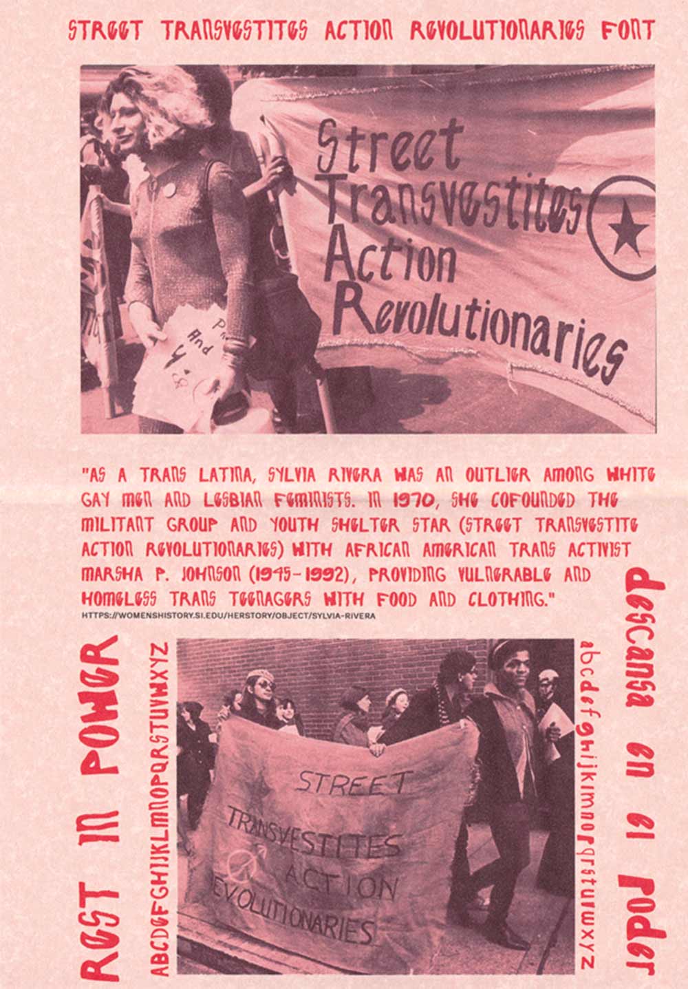
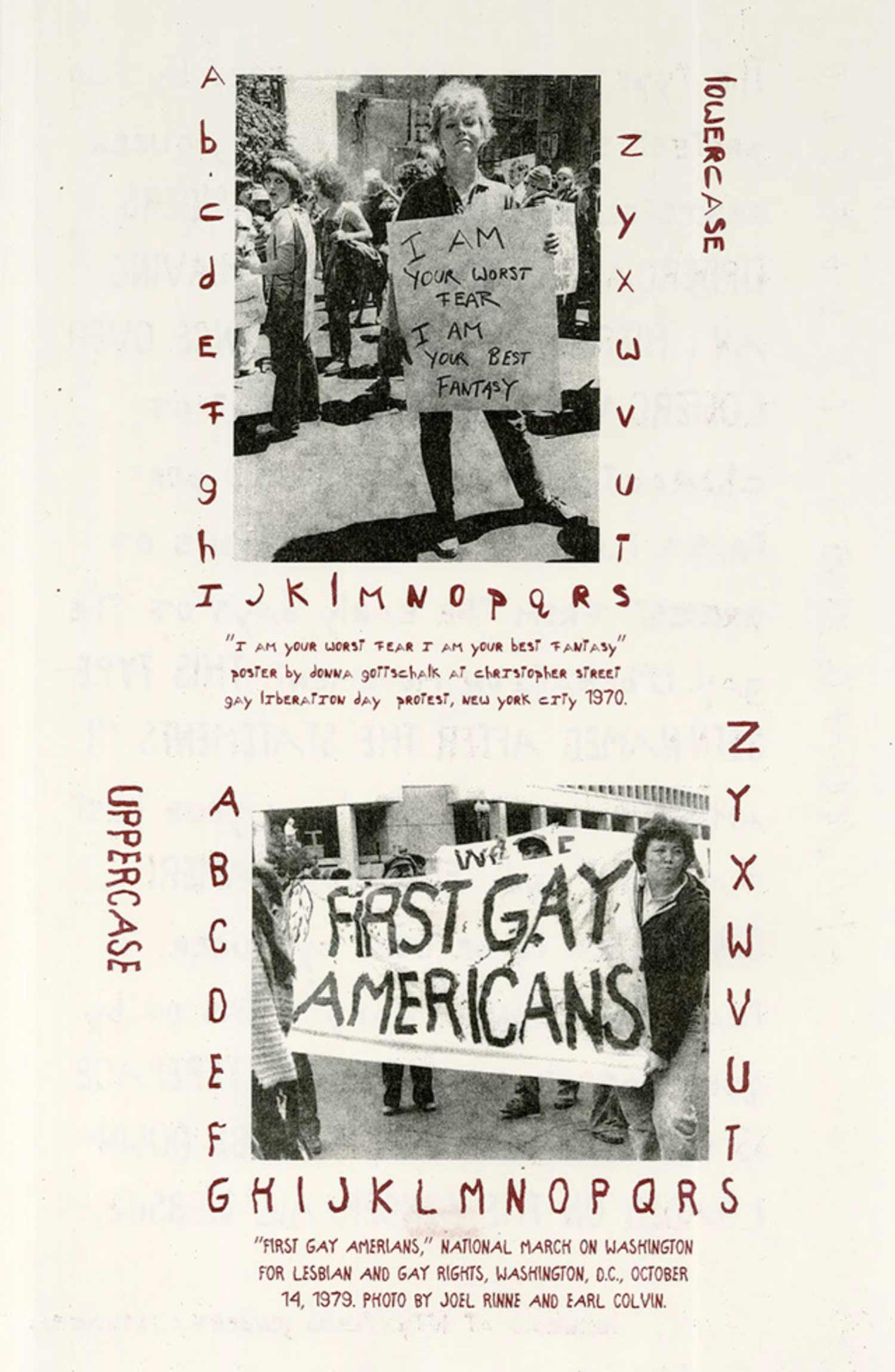
Be Oakley also has a type design project that reanimates queer, countercultural acts, called Protest Sign Fonts, released through their publishing project GenderFail. Each typeface is inspired by hand lettering from protest signs, like this one on the left from the early transgender group STAR (Street Transvestive Action Revolutionaries), and on the right, an activist who holds a sign reading “i am your worst fear i am your best fantasy” in 1970. These open type design projects by Nat and Be use the glyphs of a font and the structures surrounding the distribution of fonts as opportunities to radically disseminate histories, to reference queer acts,

and to embed these references into present-day acts of queer writing. They work to disseminate fonts under values of maintenance and care. Here are similar projects from Paul Chan, from 2002,

and more recently, the fonts of designer Tre Seals, from their foundry Vocal Type.
Beyond the distribution of fonts, there is the problem of the individual author who maintains control over a system. That is, the problem of sovereignty—the authority to govern. In the governance of typography we have a very long history of prioritizing white men as cult heroes. We establish his legacy, worship and emulate him, award prizes, and evolve entire industries in and around his power.
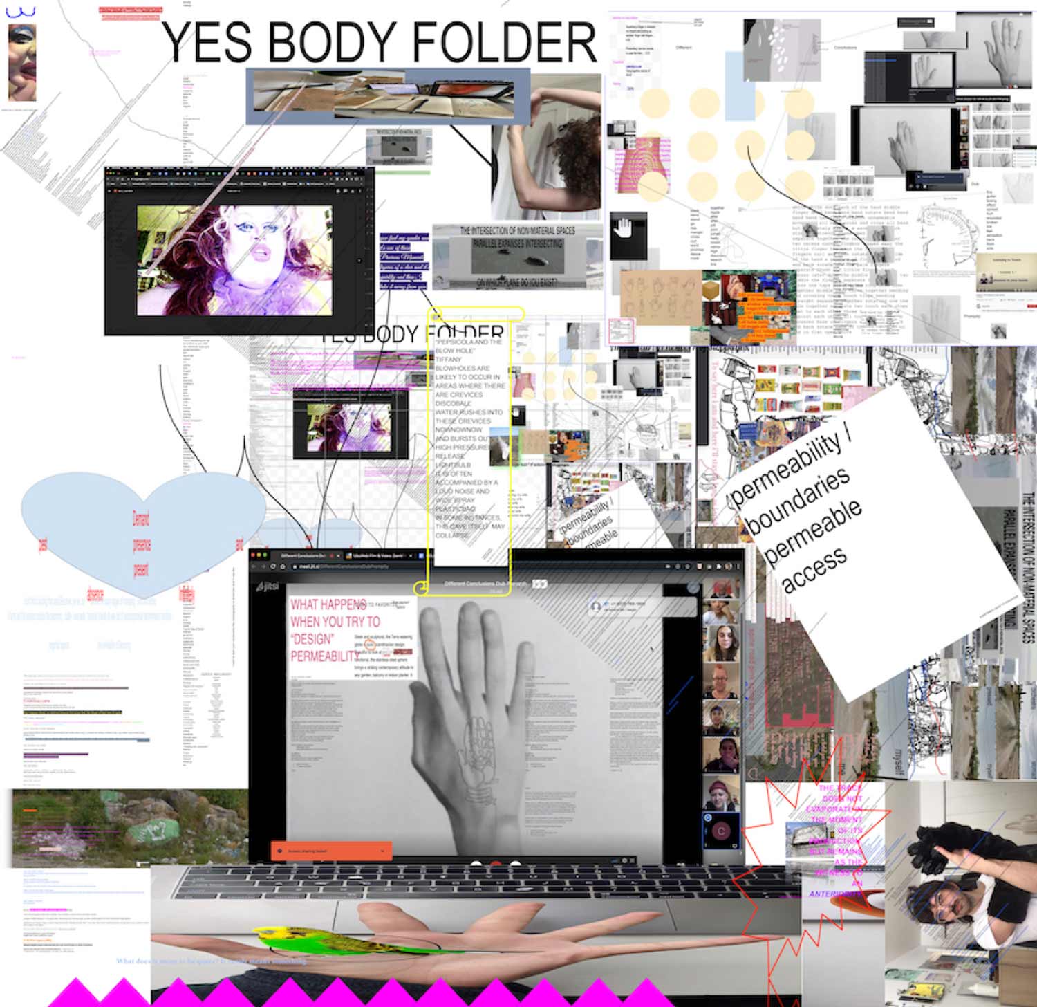
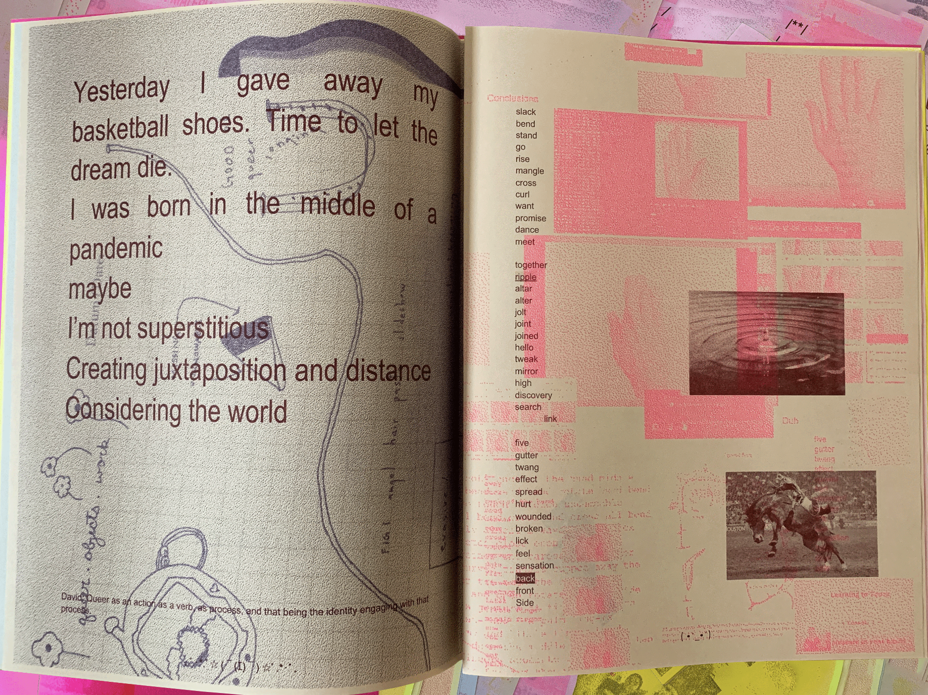
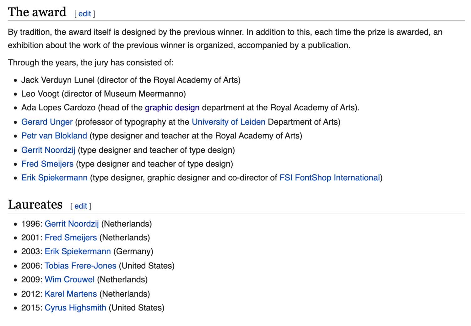
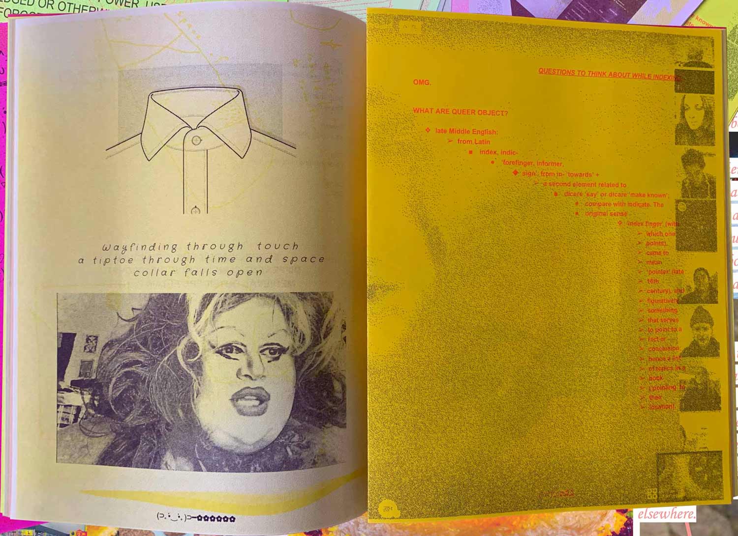
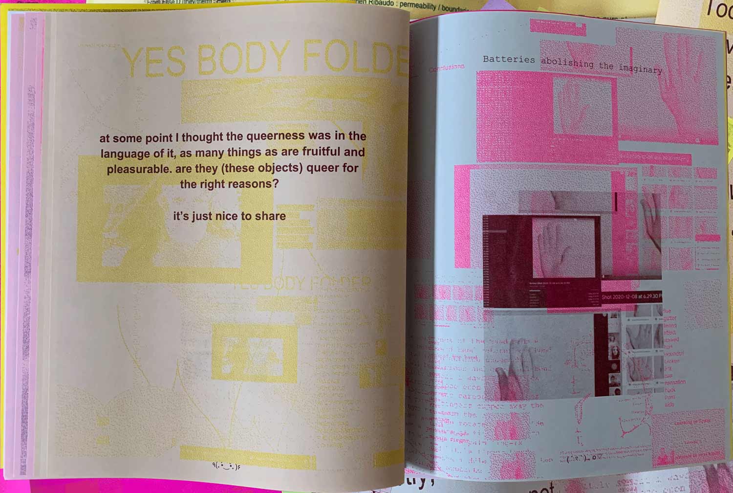
One way to challenge this mythology is to experiment with non-hierarchical, non-linear typographic practices that prioritize the collective—moving from the I to the we. At Queer.Archive.Work, a small non-profit community space that I steward, we recently designed a publication that experiments with the we—in this case, a group of 25. Last fall and winter, without a clear agenda, we created workshops that simply made space for being and making together.
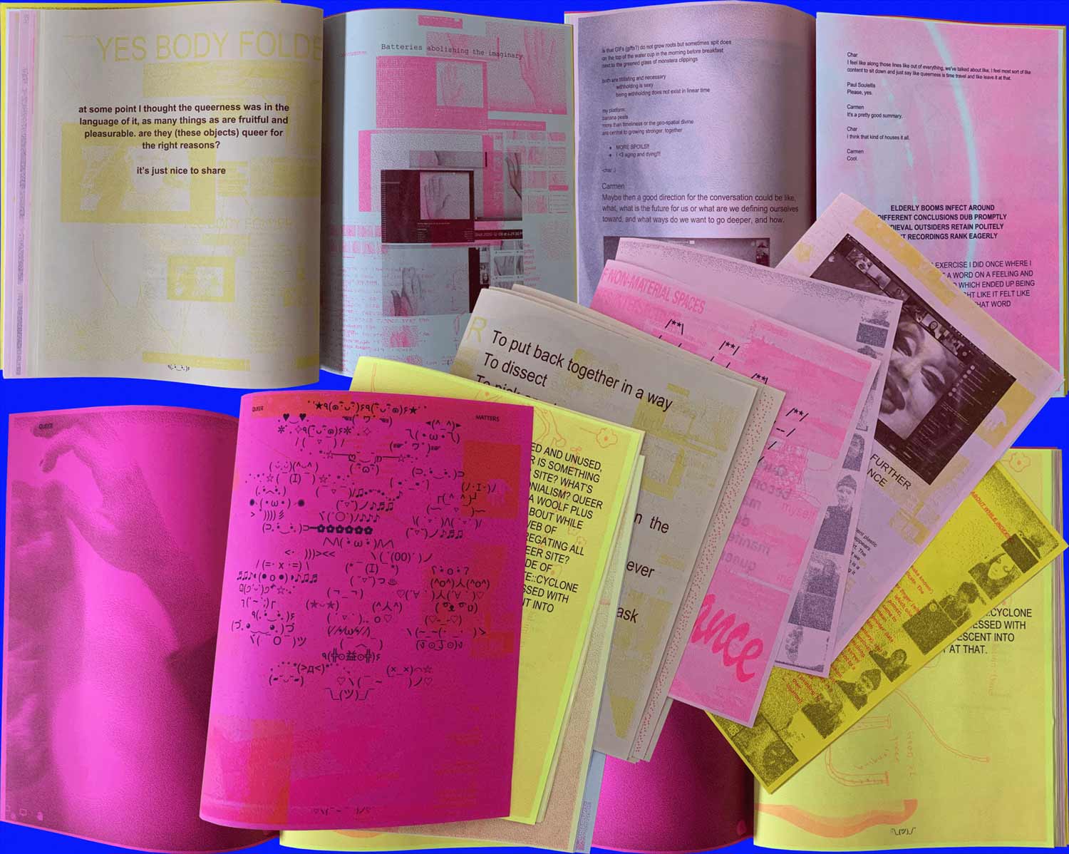
We let our content evolve from the collective interactions of the group, all of which happened online. We characterized it as queer, collaborative writing, which then turned into queer editing, and designing, in a Google doc.
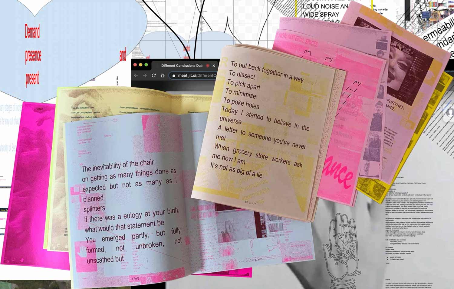
The group produced 60 pages of designed material, without any one author or governing system imposed on the process, which resulted in something that speaks clearly to some, less so for others. The risk of turning away some readers was eclipsed by the desire for an open, communal space for queer relating, making, and action that produced something that helps to shape who we are as a community. I’ve never seen anything quite like it.
If this talk answers anything about the question “what is queer type” I hope it’s this—that we need to stay with queer as an action, actively engaging with the past and the future as a verb. As in: queer acts of disrupting, interrupting, agitating, and surviving against normative logics of success.
I propose that we turn away from rainbow style and gender metaphors, towards queer acts of doing. From queer type to queer typing. Queer acts of reading and writing. Performative, non-conforming acts that deviate from the expected. Focusing on the people and communities where good trouble emerges. Those who perform deviant acts of design in the face of conformity.
Let’s search failure’s byways, and all the spaces in-between the superhighways of capital, to find the activism in the queer lives of Octavia St. Laurent and Marsha P. Johnson and Angie Xtravaganza and David Wojnarowicz, as well as the countless, forgotten artists and activists whose names we don’t know. All of the queer acts that lead to very specific kinds of decisions, whether it be how to sign your name, or how to start a movement.
May 2021
Back to top
Download as PDF
Many thanks to everyone on Twitter and Are.na who provided generous input to help shape this research. I’m especially grateful to readers Sal Randolph, nicole killian, Nat Pyper, Charlotte Strange, Arnon Karnkaeng, David Kim, and the QAW Collective for their support and feedback.
Presented at:
Type Directors Club
Type Drives Communities Conference 2021
May 7, 2021
paul@soulellis.com